Our Home Editor, Audrey, takes us on a tour of her strikingly minimalist – but also warm and cozy – dining room.
When it came time to design our dining room, I knew that simplicity would be imperative. With two young kids and lots of foot traffic moving through the room, the room needed to be spacious and open.
When you walk in our front door you enter through the living room, which connects to the dining room. You have to walk through the space to access the remainder of the house, so we needed to allow for that flow. During our renovations, we asked the contractor to move the positioning of the chandelier so that we could center the dining table as far back as possible. This allowed for a wide walkway in front of the table, while still leaving enough space for the dining table and chairs.
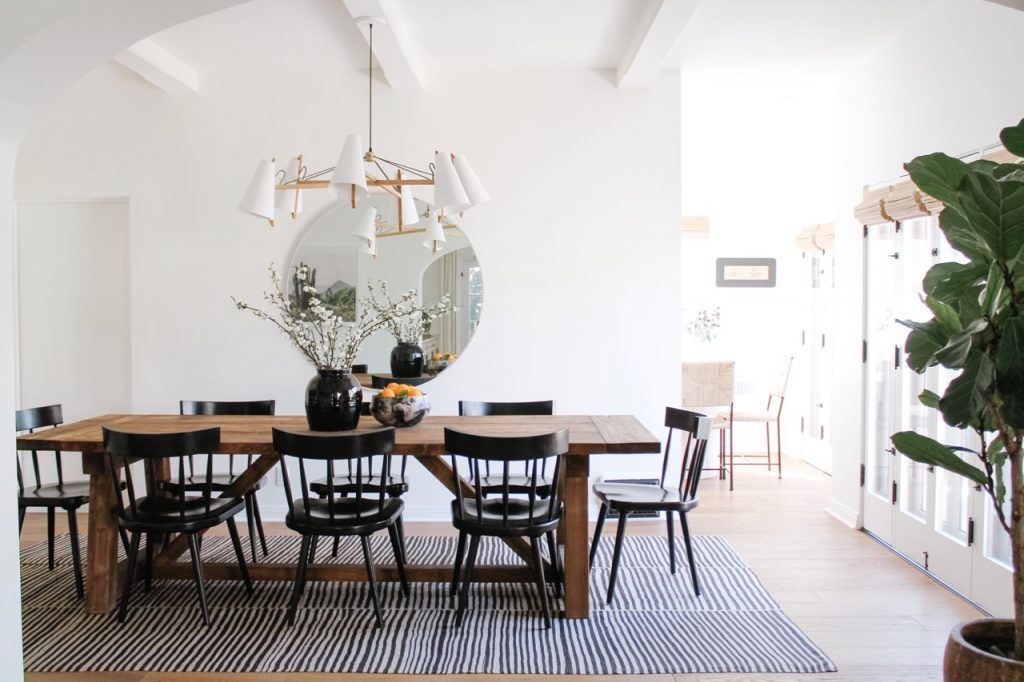
As a lover of vintage rugs, I typically start designing a room with the rug. It grounds the space and really sets the tone, so it’s a nice place to begin. Our living room rug is a mix of blues, greens, and browns with more of a floral motif, so I knew that I needed a different style of rug for the dining room. I found this striped vintage Kilim rug and quickly pulled the trigger. I love that it has a more neutral colorway while still bringing character into the space.
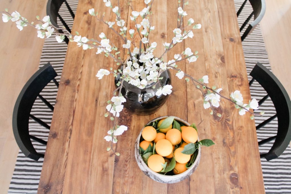
Up next was the dining table and chairs. I knew that I wanted a reclaimed wood table, and I fell in love with this one which is made of 100-year-old pine timbers from Great Britain. {Pro tip: use a pure tung oil with a matte finish to protect your wood dining table!} To contrast the brown in the dining table, I chose black dining chairs with a mid-century vibe. They have a curved backseat which helped offset the square edges around the room.
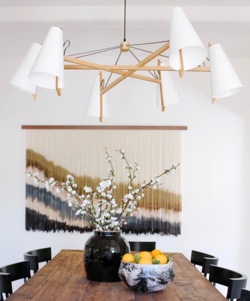
For the chandelier, I knew I wanted something that felt lightweight and airy. This Hood Chandelier by Brendan Ravenhill incorporates wood, metal, and shades in a way that I had never seen before. Under it, we placed faux floral stems in a black ribbed jar and citrus from our yard in a vintage marbled bowl on top of the dining table.
The walls were the last piece of the puzzle, and they were definitely the part that I spent the most time on. Hanging something on the wall feels so personal, and I really wanted to choose pieces that I truly loved. The large, colorful wall tapestry by Lauren Williams was a no-brainer. It was my second time commissioning Lauren to design a piece for our home (she made a round tapestry for our living room in our former home), and I’m pretty sure it’s my favorite thing in the whole house. I commissioned a local glass company to cut the round mirror behind the table, and I hung one of my favorite landscape prints on the opposite wall.
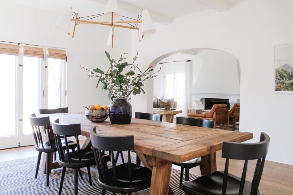
Designing this space definitely taught me the importance of slowing down and taking my time. We waited until we found exactly what we wanted, and we invested in pieces that will stand the test of time. Now, if only I knew how to cook so we could actually feed people at this table…
– Audrey
Check out more of Audrey’s spectacular home renovations and decor ideas here.
