Our Home Editor, Audrey, takes us on a tour of her gorgeous living room, decorated in calming neutral tones and textures.
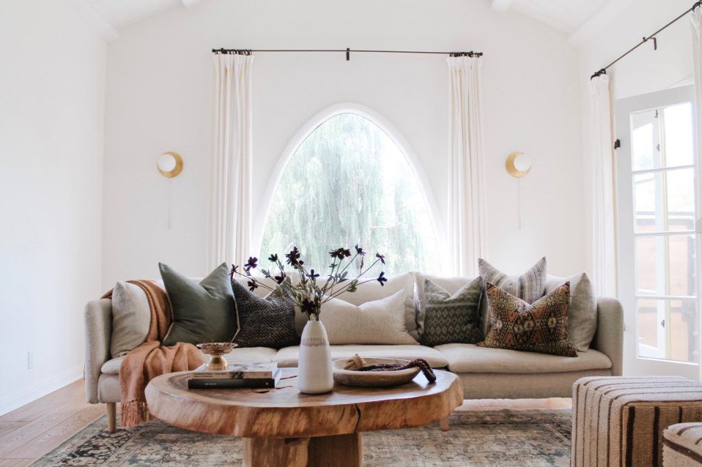
Welcome to our living room! While it’s the least-utilized space in our house, it’s certainly my favorite from a design perspective. The living room was a huge selling point when we first saw the house back in February of 2019 – I knew there was potential the second I saw the large windows and vaulted ceiling. I also quickly realized that the layout of the room would be tricky.
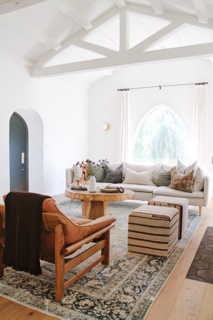
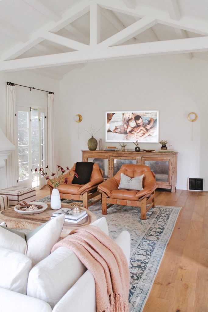
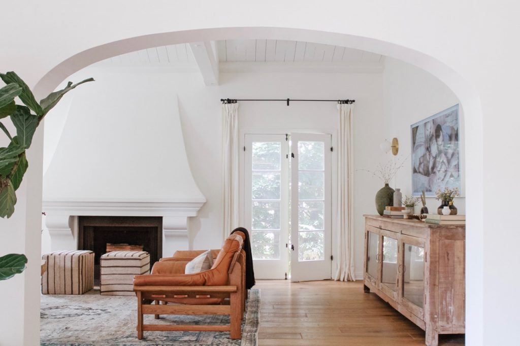
The living room is long and narrow, with a fireplace in the middle of one wall, a large, arched window in the middle of another, and the entrance to the dining room dominating a third. There was only one wall that could possibly be used for a television, and it took us months to figure out a seating configuration that made sense based on the location of the TV. To make things easier, we chose a television that doubles as art when you aren’t using it.
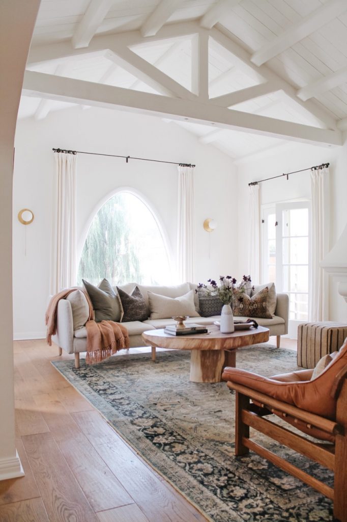
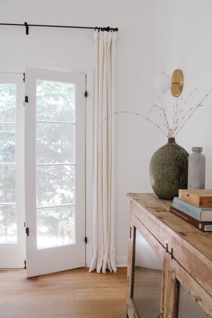
During renovations, we did several things to the living room that made it feel more updated and workable: we painted everything white (including the vaulted ceiling beams!), removed all of the track lighting, added 4 wall sconces, laid new hard wood floors, and updated the tile in front of the fireplace. This gave us a fresh start as we started to bring in furniture and décor.
Shop Audrey’s Style
For furniture, we started with the basics: a large, vintage rug to ground the furniture, an entertainment center under the television, a sofa, and a coffee table. We positioned the sofa as far back as possible on the rug to keep the space open. It’s just close enough to the television, but still allows people to walk in the front door without running into a huge piece of furniture.
To increase the seating options for such a large space, we added two square poufs and two leather chairs. The poufs work nicely in front of the fireplace and make the space feel modular – we can move them around and use them as side tables and foot rests. The two leather chairs also move based on our needs (i.e. my husband turns them around to face the television whenever he’s playing video games).
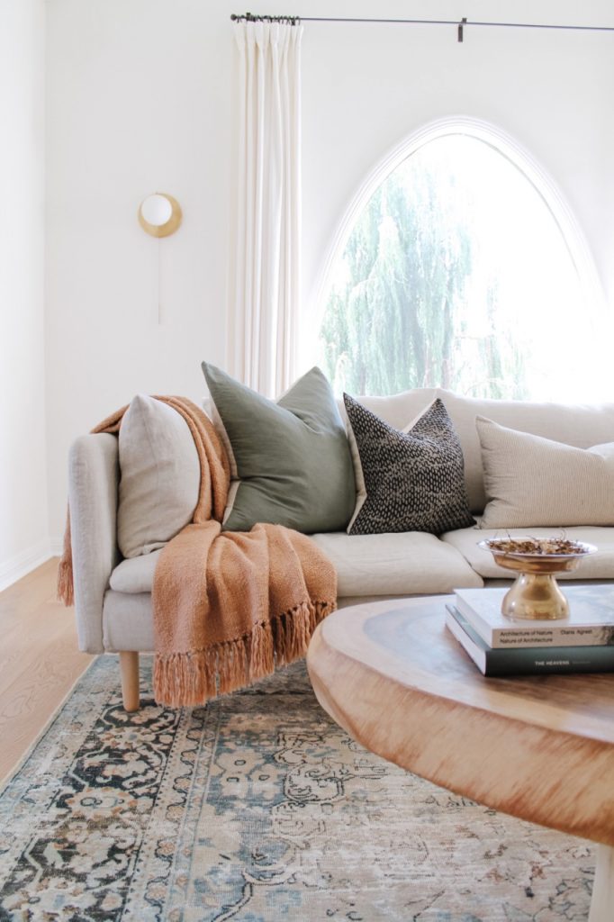
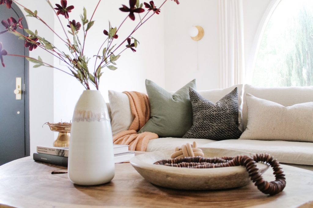
When it came to décor, I knew that I wanted a layered look with a mix of textures and colors. I stuck to the same color palette that we used in most other places throughout the house: neutrals and muted tones that compliment one another nicely. We also mixed metals by choosing brass sconces and flat black curtain rods. The white window treatments allow the space to feel open and airy, and the neutral sofa gave me additional opportunities to incorporate color in the pillows and throws.
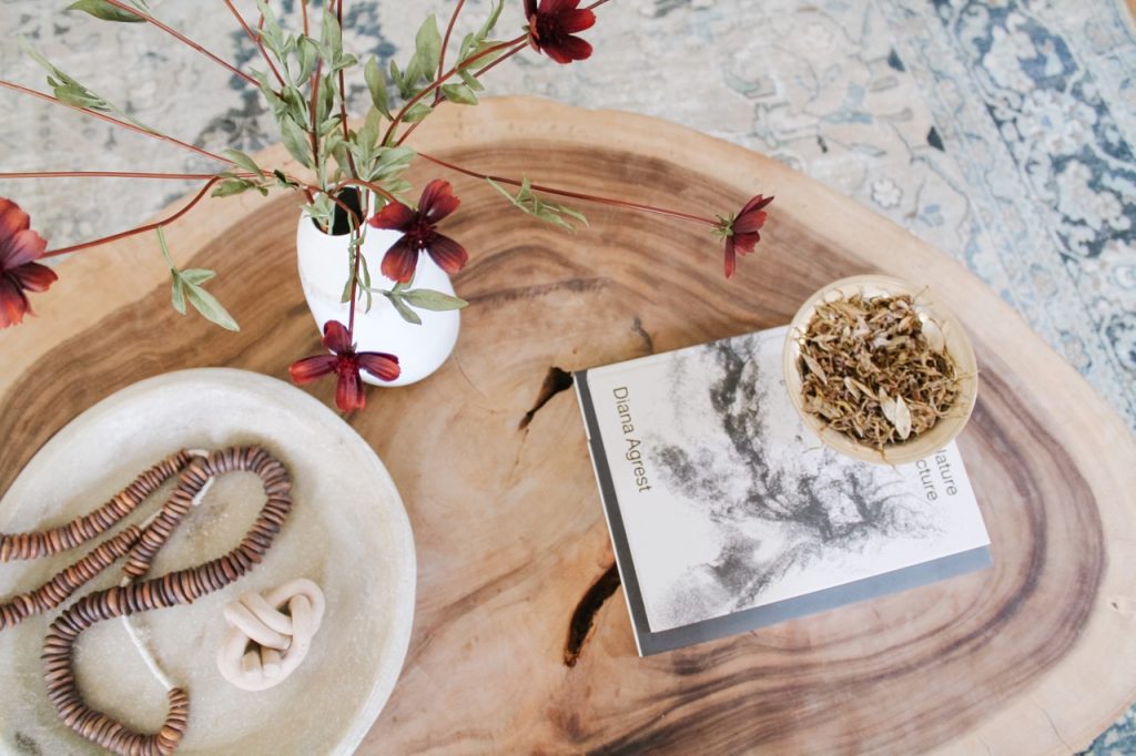
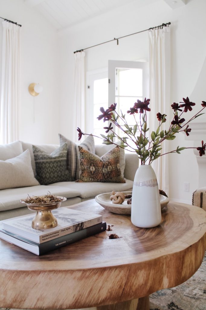
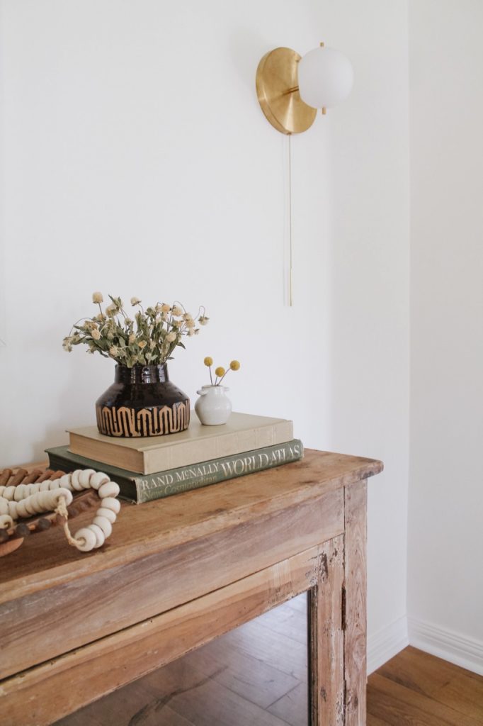
We keep the coffee table and entertainment center styling relatively simple given that we have two young kids running around. When it comes to surface styling, I typically utilize a mix of trays, books, decorative objects, vases, and dried florals. We also chose furniture pieces that are pretty indesctuctible. The sofa covers can be thrown in the washing machine, and the leather chairs will age naturally over time. In true Virgo fashion, I totally scotchguarded and leather-protected the heck out of everything. I’m thinking that someday when we actually have time to sit down and relax, we’ll really enjoy using this room. Until then, it brings a smile to my face when I walk in the front door each day.
– Audrey
Scroll down for more photos, and check out more of Audrey’s spectacular home renovations and decor ideas here.
