Posts Tagged: Before and After

Decor

The Three Most Swoonworthy Doors In The Whole Wide World

kim lewis for rustica hardware door designs

Mood board by Kim Lewis of Extreme Makeover: Home Edition

Remember my sliding barn door from Rustica Hardware? The one I installed when we first moved in and discovered that the master bathroom sink was located directly next to where our heads would be when we were sleeping (ew)? It remains one of my favorite design features in our house to this day, and so when I decided that I wanted to turn our garage into a multipurpose room that would significantly expand our square footage, I asked Kim Lewis - who recently designed the most spectacular collection of statement doors for Rustica Hardware - if she'd be willing to help me figure out which ones would work best in the space.

What I wanted: An industrial-style sliding door to separate the laundry room from the rec room part of the garage, and then a second door separating the garage from the dining room area (the one there now is just a standard white door, and I felt like this was an opportunity to communicate that what's behind the door is worth seeing). The problem: the two doors will be located in close proximity to each other, so they have to communicate a similar vibe without being...the same.

Before & After Renovations

10 Home Renovation Projects You Have To Try

blogger jordan reid of ramshackle glam

Remember back in 2009, when I decided that I was the kind of person who should write a website about cooking, DIY, and home decor, and that it should be called "Domestic Bliss"? Yeah, I have no idea what I was thinking either - other than, perhaps, "fake it 'til you make it" - because for the first few years, "faking it" is exactly what I did. At the time, my idea of a homemade meal was store-bought pasta with jarred tomato sauce (to which I'd added onions and mushrooms - you know, to make it fancy), and was SO IMPRESSED with myself for completing "DIYs" such as...swapping out drawer pulls. Putting up a sticker decal was a feat worthy of a full video tutorial, and I thought that my idea of using teacups to serve soup during parties was the height of inspired entertaining.

I still think that serving soup in teacups is pretty neat, but a lot has changed since the halcyon days of wallpaper-wrapped lampshades and green chalkboard refrigerators. I'm still no Ty Pennington, but after renovating two homes and working on a home construction and design show, I now know about 20,000 times more than I ever thought I'd know about how to update a household on a budget. Below are ten of my all-time favorite house upgrades, all of which I promise you are more than capable of taking on yourself.


Decor

Side Yard Makeover: From No Man’s Land To Most Useful Space Ever

...What is this "side yard" of which you speak?

Side yards are not a thing I have any experience with, and definitely are not something I have given much (if any) thought to. Like, ever.

I didn't even have a side yard at our house in NYC (or, I guess I kind of did because there was a space between our house and the house next to us, but it consisted largely of a spricket-and-poison-ivy-infested wasteland. Then I moved out to the California suburbs, and everyone here seems to have a pair of functional side yards. We have neighbors who use the long, narrow spaces that run along the edges of their houses for storage, as dog runs, to hold chicken coops, as play spaces for their kids - all kinds of things.

Decor

A Little House Tour (Two Years Later)

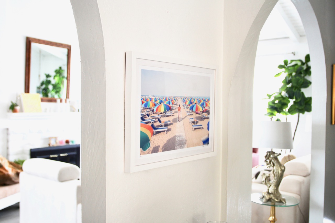
Riccione Multicolor Umbrellas, by Gray Malin

Let me take you back to an era many, many moons ago. The Supreme Court had just affirmed same-sex marriage, a record-breaking 195 countries had signed on to endorse the Paris agreement (including the U.S.! Imagine!), and "athleisure" had become a word that people actually used in casual conversation.

Another thing that happened around that time: Our family drove up to a California ranch house that we'd only ever seen in photos, and right there on our brand-new porch, waiting patiently for us, was a housewarming gift: A print of a San Francisco nude beach taken by my all-time favorite photographer, Gray Malin. It took us many days (and months, and years) to wind our way through the process of making that funny little ranch house our own, but one thing that happened on Day One was that the nude beach print went right up on our dining room wall. Once it was hung, I laid down on the floor with a cup of warm champagne and looked at it for awhile - the waves swirling up onto the sand; the rainbow of striped beach blankets; the many, many naked butts  - wondering what what was to come.

Before & After Renovations

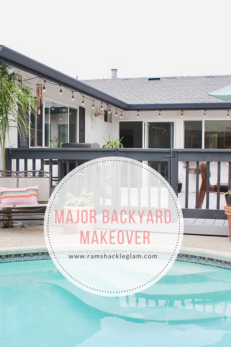
My Dark, Dated Backyard Got A Light, Bright Makeover

I think I bought our house because of the pool (okaaaaay, and the school system). Not because our pool is especially pretty - it's not. And was extra-not when we moved in thanks to a semi-terrifying algae issue that alerted us to the fact that the water hadn't been changed in eight to ten years (uggggggg). No no: the exciting thing about our pool was the fact that it existed. And was part of a property that we could actually afford. (Such a fortuitous combination is, shall we say, "uncommon" in the Silicon Valley area.)

The reason I wanted a pool so much is because I hate entertaining. (Stay with me, because I'm aware that this doesn't make sense.)

See, here's the thing: entertaining makes me fall asleep, like those narcoleptic goats on YouTube. I've mentioned this before, and it's true: all I have to do to get in a really good nap is know that I am about to be forced to interact with large numbers of human beings.

Decor

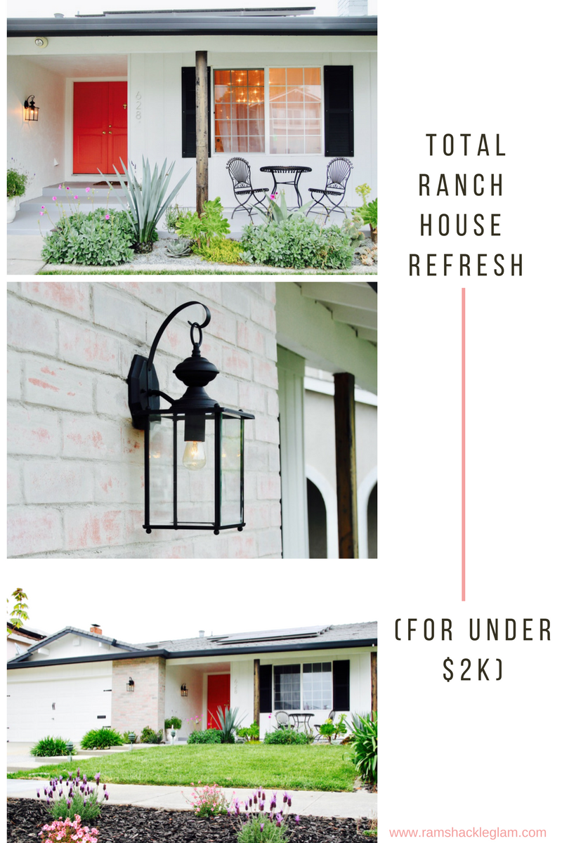
My (Incredibly Boring) Ranch House Got An (Incredibly Cool) Facelift

ideas for how to make a boring ranch house feel modern

When we first moved into our house, I did a lot of work on the inside - adding entryway tile, turning a tiny bedroom into an office/playroom, adding lighting, et cetera - but aside from doing some (necessary, thanks to the drought) xeriscaping, I pretty much gave up on the house exterior. It was tan and dusty blue - with an orange-brick "accent wall" - and sure, I figured, I could paint it...but it'd still look like what it was: a more or less personality-free ranch house built in 1969. It's not the kind of house that screams, "Emphasize my architectural details and singular flair!" Because on this house, details and flair are nowhere to be found.

But still, every time I drove up to the house, it bugged me how much I disliked it. So the first thing I did was paint my door pink. This was done pretty poorly, because I did it myself, but at least it helped (a little). Then I decided that the orange brick was the next-worst spot, and my friend Erin helped me do a mortar wash on it. And then, when we had our kitchen done, I was so impressed by how excellent and affordable the painters were that I asked for a quote on painting the house, and: yes. (FYI, in case you're local: I used Proficient Painters. If you click over to their site you'll see pics of this makeover, but that's not because they did the work for a discount or anything - I just liked them a lot, so I gave them pics to use in their gallery.)

What I decided to do: give a sort of nod to the house's 1969 build date with a mod-ish color palette of white, black and pink, and then figure out a few places to add high-impact details.

DIY Projects

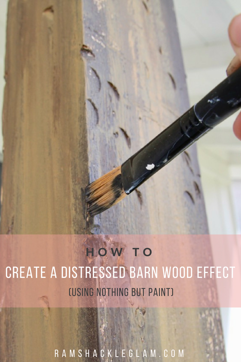
How You Make Your Ugly, Boring Wood Look Like Gorgeous Reclaimed Barnwood – For Just A Few Bucks

how to create a faux distressed wood effect with paint

The poles in front of our house have always vexed me. They're ugly - just blah wood that's been painted white - but they're also necessary, being as they sort of...hold the house up. We're getting towards the end of our full exterior makeover - which I'll be posting later this week, as soon as I finish up the last few details - and over the course of the process I've toyed around with a few different ideas for what to do with them. I didn't want to paint them an accent color, because they're not particularly attractive and don't really need to be "accented," and sure, I could just paint them the same color as the body of the house...but eh. They felt like an opportunity to do something cool.

I considered "wrapping" the posts (basically covering them with pieces of nicer-looking wood), and even dragged a bunch of barn wood boards home from Home Depot, but ended up realizing that even if I could make this look good, the wrapping would create a weird gap at the top of each post. And then I also realized that the boards were too narrow, and dragged them all the way back to Home Depot, and got frustrated and decided to try something else.

That's how I found myself standing in front of my bathroom door - the sliding barn wood door in our bathroom.  You know, this one:

DIY Projects

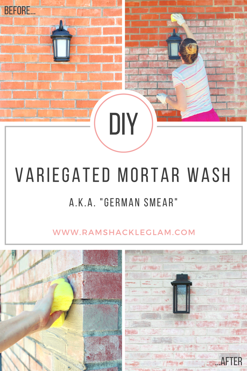
The Mortar Wash (Or “German Smear”) Experiment

The hideous, bright-orange brick on the exterior of my house has always vexed me: what to do about it? I mentioned this to my friend Erin, and she said oh, why don't you try a German Smear?

...See, to me "German Smear" sounds like a porn that I don't want to see. (Or maybe that I really, really do, depending on my mood and whether I've eaten recently.) Or maybe an extremely delicious sandwich. But probably not something I want to have happen to my house.

Decor

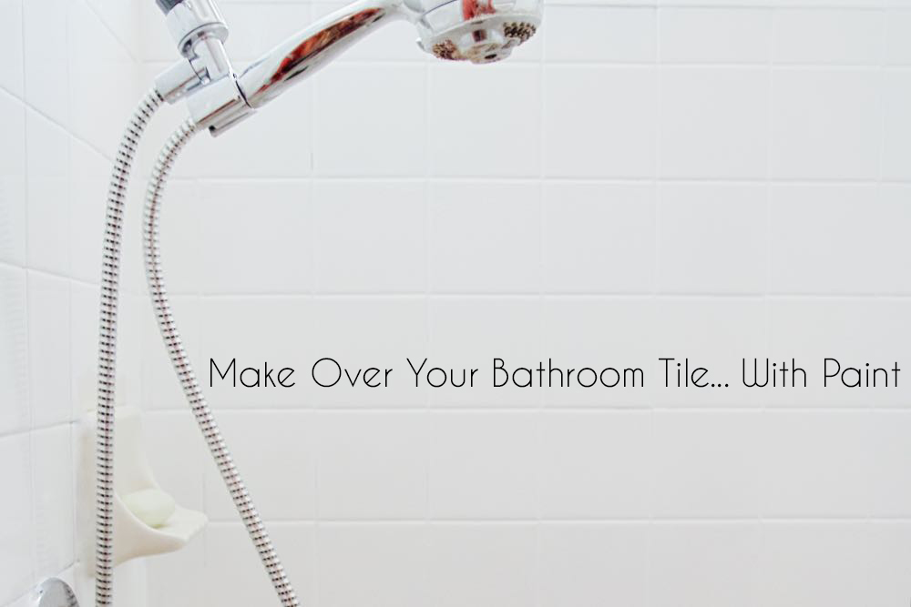
A Bathroom Tile Makeover…With Paint

how to make your bathroom tiles white with paint

Remember my little run-in with a full jar of gold leaf a few weeks ago? (Not one of my finest moments.)

But honestly? I wasn't all that upset about the fact that I'd just completely destroyed my floor with a permanent paint-splatter. Because I'd already decided that I was going to (finally) do something about the terrible, dark-grouted, 1970s-style tile in our master bathroom. And the solution that I'd come up with would mean that I'd be able to fix up the floor (which was tinted a lovely shade evoking a 1981 urinal) as well...at no additional cost.

Stay with me.

Decor

It’s A Party In The Bathroom

Jordan Reid home decor

Note un-sweaty hair and relative non-dishevelment. (This is the “before” photo.)

Our bathroom – the one off of the master bedroom – is easily the most unattractive spot in our house. It is tiny-tiny-tiny (you can barely open the door if you’re standing inside), and is accessorized with nothing more than a dark-brown, 2-inch-deep cupboard that holds literally nothing – even miniature medicine bottles come tumbling out when the door opens. My least-favorite part of the bathroom, though, has to be the color: a vaguely nauseating combo of olive green and beige. Not “forest green” and “ecru”…olive green and beige.

Olive green and beige are not my happy colors.


powered by chloédigital