Posts Tagged: audrey

Decor

Room Tour: A Toddler’s Bedroom Gets A Warm, Modern Makeover

Our Home Editor, Audrey, is moving to Texas! Sad for me, excellent for RG...because now she'll have a whole new house for us to tour. Before she goes, let's look at her favorite decor moment in the house: Her four-year-old's warm, modern bedroom.

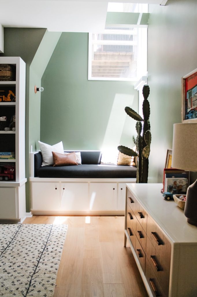
Before we pack up and move to Texas, here’s a farewell tour of our favorite bedroom in the house: Huxley’s room! When the house was built in 1926, this was the original primary bedroom. In 1986, the previous owners converted it into a library when they added a second story and moved the primary bedroom upstairs. When we bought the house last year, we removed the back wall of built-in shelves to make room for Huxley’s bed so that the space would feel more like a bedroom.

When designing this space, I started with the wall color. I fell in love with Oakmoss from Sherwin Williams, and we’re actually going to paint Huxley’s Texas room the same color! From there, I chose the Malta Hand-Knotted Jute rug from Serena & Lily, which brought in some pattern and texture. I'm a big fan of choosing the largest rug possible for kids’ rooms to maximize the soft play space on the floor. For this room, we went with the 9x12 size, which also provides ample protection for our hardwood floors.   
Shop Audrey's Style

Decor

The Most Calming Living Room I Ever Did See

Our Home Editor, Audrey, takes us on a tour of her gorgeous living room, decorated in calming neutral tones and textures.

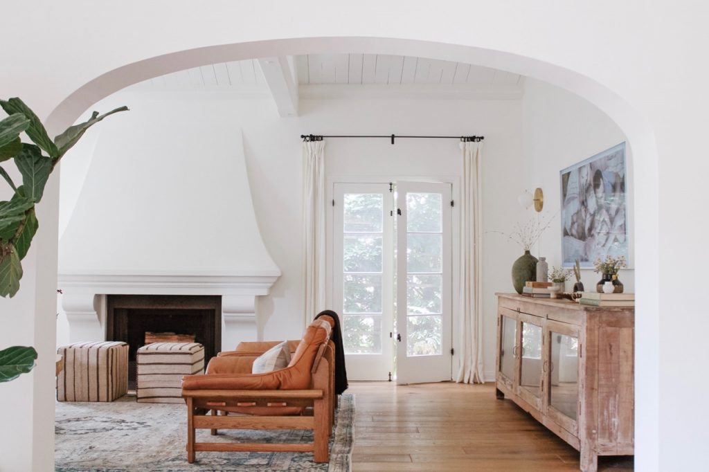
Welcome to our living room! While it’s the least-utilized space in our house, it's certainly my favorite from a design perspective. The living room was a huge selling point when we first saw the house back in February of 2019 – I knew there was potential the second I saw the large windows and vaulted ceiling. I also quickly realized that the layout of the room would be tricky.

The living room is long and narrow, with a fireplace in the middle of one wall, a large, arched window in the middle of another, and the entrance to the dining room dominating a third. There was only one wall that could possibly be used for a television, and it took us months to figure out a seating configuration that made sense based on the location of the TV. To make things easier, we chose a television that doubles as art when you aren’t using it. 

During renovations, we did several things to the living room that made it feel more updated and workable: we painted everything white (including the vaulted ceiling beams!), removed all of the track lighting, added 4 wall sconces, laid new hard wood floors, and updated the tile in front of the fireplace. This gave us a fresh start as we started to bring in furniture and décor.

Lifestyle

Tour Audrey Scheck’s Clean & Cozy Dining Room

Our Home Editor, Audrey, takes us on a tour of her strikingly minimalist - but also warm and cozy - dining room.

When it came time to design our dining room, I knew that simplicity would be imperative. With two young kids and lots of foot traffic moving through the room, the room needed to be spacious and open. 

When you walk in our front door you enter through the living room, which connects to the dining room. You have to walk through the space to access the remainder of the house, so we needed to allow for that flow. During our renovations, we asked the contractor to move the positioning of the chandelier so that we could center the dining table as far back as possible. This allowed for a wide walkway in front of the table, while still leaving enough space for the dining table and chairs.

Decor

A Very Malibu Makeover

sunset with my loves

CLEARLY the point of living in Malibu is to enjoy all that beach-adjacentness as much and as often as possible, which means creating a lovely outdoor space was fairly high on my priority list from the second I moved in. I got rid of all of my outdoor furniture when I moved - it was so old that moving it would have been more expensive than it was worth - which left me in the market for some new stuff. But my wraparound deck situation perplexed me a little. It's very long, and quite narrow, and the only area big enough for a table is next to the front door.

Here is where having a friend like Audrey is a blessing from the home decorating gods: I asked Audrey what she thought I should do with the deck, and do you know what she sent me?

Before & After Renovations

How We Turned a Doctor’s Office into Our Guest House

Home contributor Audrey completely reimagines a former doctor's office in her new house...with jaw-dropping results.

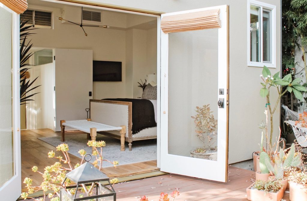
When we were looking for our new house, we knew that we needed a space for guests. My family lives in Texas, and we love having them out to visit. We also have friends who regularly come to Los Angeles, so we almost always have someone staying with us. When we first toured our new house, we noted the detached doctor’s office behind the house, which had three rooms – a waiting room, a bathroom, and a main office. I knew that with a little work we could convert the space into something that would allow us to comfortably host frequent visitors. 

Main room, before

Lifestyle

Holiday Gift Guide: For The Home Decor Junkie

Home contributor Audrey deploys her exquisite taste to help you shop for the stylish homebodies in your life.

Shopping for an interior design guru can be more than a little intimidating. The desire to find something truly unique, purposeful, and stylish can definitely be overwhelming, but with so many wonderfully curated home décor shops and a plethora of highly skilled artisans creating distinctive home goods, it’s easier than ever to find something for the person who doesn’t want their house to look like everyone else’s.

After dedicating this year to designing, renovating, and styling our new home, I feel like I’ve seen it all. I’ve compiled a list of my favorite finds just in case you find yourself shopping for someone who loves home décor this holiday season! 

Before & After Renovations

Play Place

Home contributor Audrey Scheck reveals a playroom before-and-after so spectacular you'll want to move into that tent immediately.

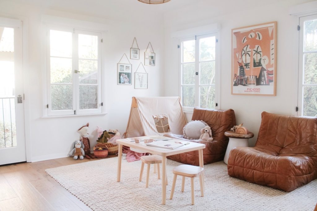
When we found our new house, we knew immediately that we would make one of the downstairs rooms into a play space for the kids. Our first house didn’t have a dedicated playroom, which meant that our living room essentially functioned as their play area. 

In other words, the toys were everrrrywhere.

Quick backstory here, because I always think it's nice to know a little about the history of a house: The previous owners were both scholars, and they each had their own office in the main house. Her office (which is now our playroom) was downstairs, with an exterior door leading out to the backyard, and his office was upstairs. They also had a library downstairs and a guest room, which became Huxley and Tilly's rooms, respectively. Despite being 100 years old, the house was in great shape - it just needed a little rethinking to make it work for our growing family.

DIY Projects

How To Fall In Love With Your Contractor

Meet Audrey, RG’s brand-new Home contributor. You've actually seen her here before - she has the single best home decor taste of any human I've ever met, and I featured both her home's interior and its exterior awhile back. She recently sold that house and bought a new one, a 100-year-old place in one of L.A.'s most historic neighborhoods that she's renovating from top to bottom...so obviously I had to ask her (pictured above with her impossibly adorable family) if she'd give us all a chance to share in the gloriousness.

Audrey's also a virtual dictionary of home renovation and decor knowledge (seriously; I vet most of my home purchases through her) - so if you have any questions, now's your chance! – Jordan

Decor

House (Exterior) Tour: Audrey Scheck’s Urban Oasis

My friend Audrey has the best taste of any human being I have ever met, ever. Zero exaggeration. Her Los Angeles home - which you saw in this post a few months ago - is a master class in casual perfection, and I honestly didn't think it could get any better. And then she made over the exterior, and proved once again that she when it comes to home decor, she has an absolutely flawless eye.

The Makeover: What Audrey Did

  • Painted the house (which was originally yellow).
  • Brought in a carpenter to build custom exterior doors, gates, and lattice.
  • Installed new exterior lighting.
  • Added new exterior accents (mailbox, house numbers, doorbell, etc.).
  • Refreshed the landscaping and brought in tons of potted plants (apparently the black mulch addition was RG-inspired, haha). 

powered by chloédigital