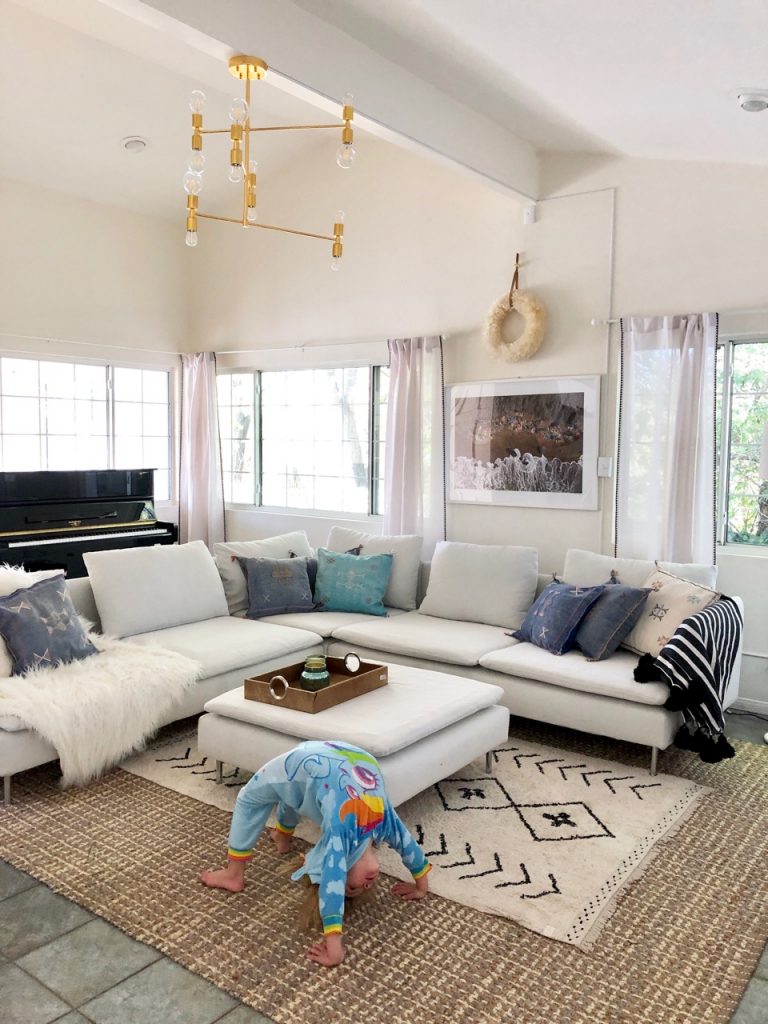
The very best thing about my house: all the lightness and brightness. It makes life as a blogger who routinely photographs herself and her surroundings much, much easier.
In other words: I love me some white walls. But I also love the idea of finding small, meaningful places to add color – at the end of a hallway; as a backdrop in the master bedroom; in a bathroom or office. And the more I lived with the office in my house, the more I realized it could use an update. A face-lift, if you will.
Before I continue: This is a rental house, so to answer your question, yes, I asked the owners for permission to paint. Before I even moved in, I talked to them about how important it is to me to be able to play around with a house and put my own unique stamp on it, and they were super down, which made me even more excited about living here. Because even with a rental, my feeling is…you know, you live there. There are reasons to put effort into a house that go beyond property value.
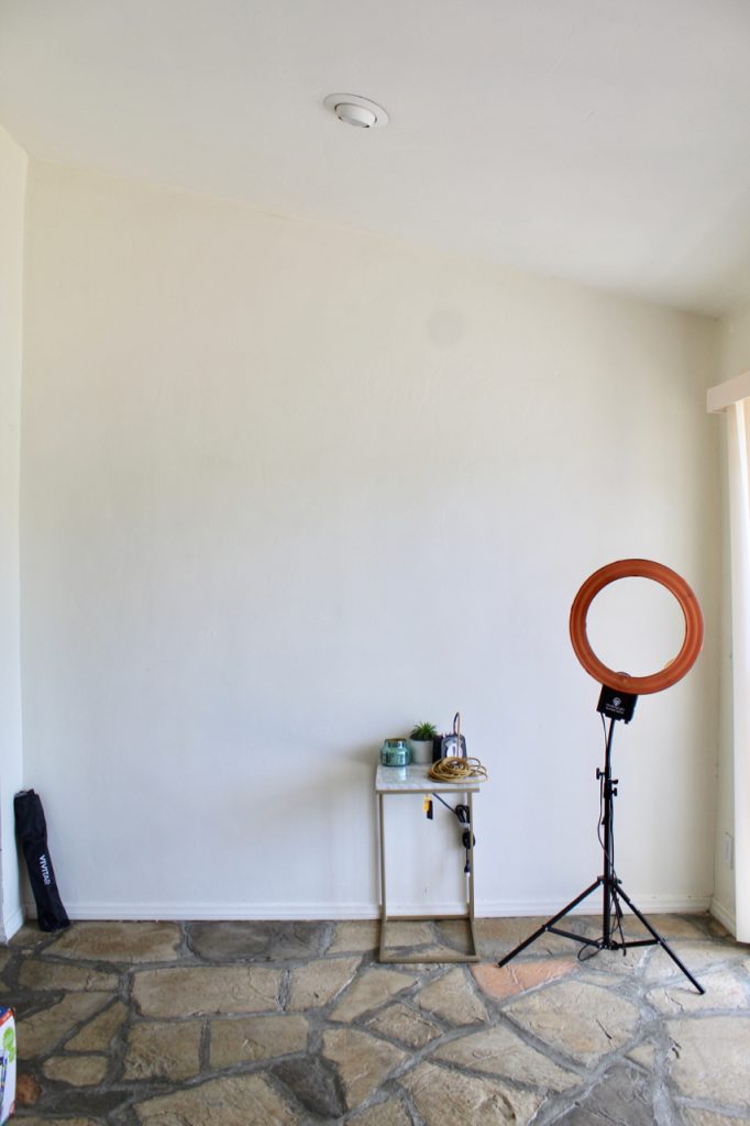
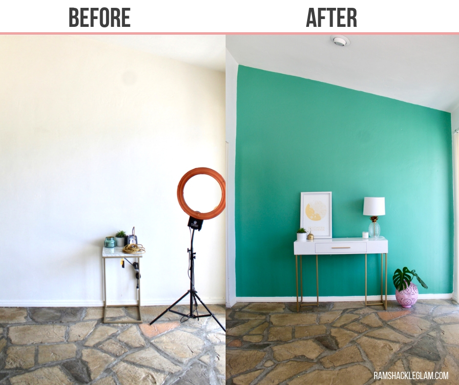
Very bright. Very meh.
Anyway, another reason I wanted to paint the office (besides the general sprucing-up of the space): I do all my product shoots in there, and while white backdrops are nice and all, it’s also nice to have options.
But about those options: What color to pick for my glorious, dramatic accent wall?! (These are the big life questions, my friends.) I’m not a huge fan of standing frozen in front of endless walls of seemingly identical swatches, so Step 1 for narrowing down the selection process was to explore Sherwin-William’s ColorSnap ® Color ID, a new collection of palettes and color options that steers you towards a palette based on your personality type, from “Free Spirit” to “Minimalist.” (My personality type, apparently, is “Trendsetter” – a palette for someone that is “confident and stylish,” and that “features trending pinks and botanical greens to showcase their role as a style leader.” So the site comes with compliments, along with suggestions! Lovely.)
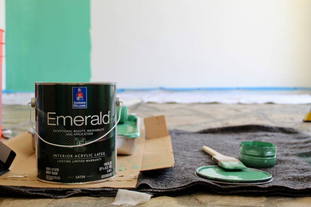
The experience was simple: You just take a 10-question quiz about your home design preferences, and you can learn what your Color ID is. What I personally enjoy about this process: It simplifies the headache that can be color selection, providing you with a curated palette consisting of 16 colors – enough to give you variety, but not so much that you’re overwhelmed by your options.
And it also works: I had been thinking of doing a green shade, and the green that the palette selected was – and I mean this – exactly the one that had been floating around in my head. The fact that I liked virtually all of the shades in my chosen palette also made me feel more secure in my decision – like, of all the greens out there, this one is clearly the one I should pick. (You can also use the ColorSnap ® Visualiser app which uses AR to virtually paint your room and is super cool.)
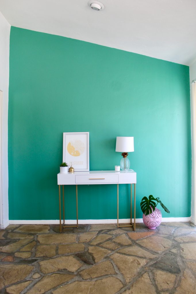
SWOON.
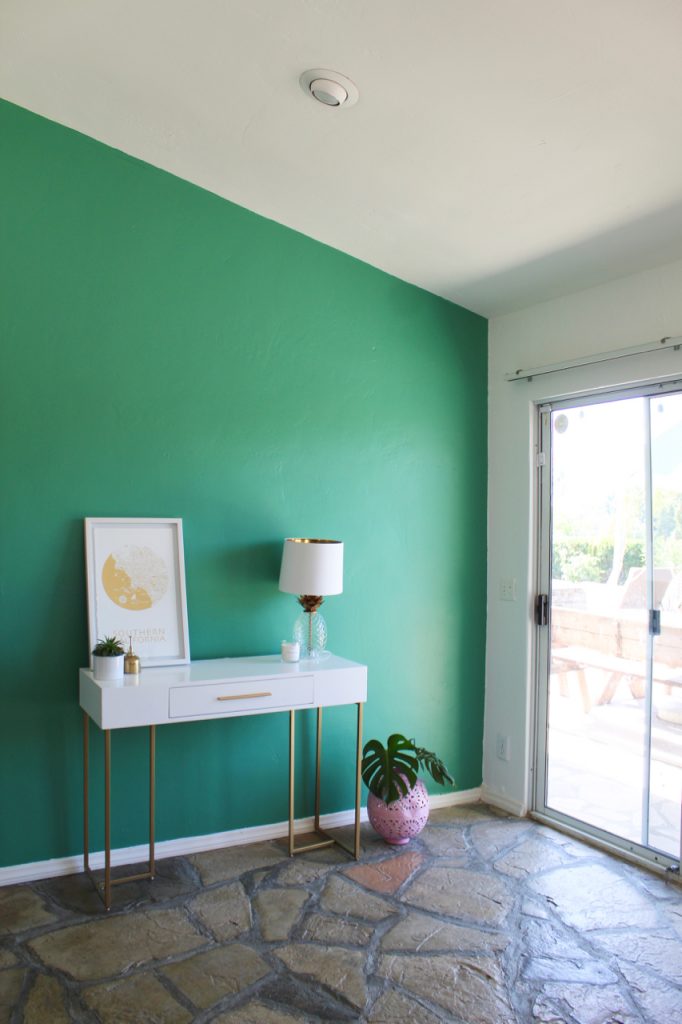
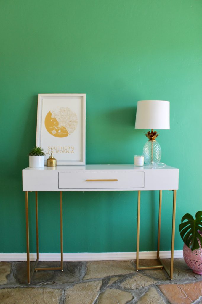
The end result: an accent wall in Alexandrite SW 0060 offset by a fresh coat of Pure White SW 7005 that’s the perfect compliment to the green (which I could feel sure of, because it was included in the same palette).
It feels clean, and fresh, and like me. Which is, as I gather, precisely the point.
If you, like me, could use a little help determining a set of colors that go well together and best matches your personality, discover which Color ID collection best fits your style with the fun and interactive experience at SWColorID.com
This post was created in collaboration with Sherwin-Williams®. Thank you for supporting the brands that keep RG ticking!


