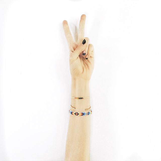
| Follow Ramshackle Glam on Instagram |
Q. Hey Jordan,
I’ve been reading your blog from just after you announced you were pregnant with Indy [and I had a question] about your new blog design and your photos – they are looking incredible! I just did a redesign of my blog, and now that I’ve “fancied” it up a bit, my photos are looking really…dull.
Do you have any thoughts on how to figure out the best style of photography for your blog, and what kind of photos will fit well with your blog’s “brand”?
Thanks so much Jordan!
Renee
A. Hey Renee,
Let me first say that I really appreciate you noticing, and I also appreciate you asking me this question. Because the fact is that there are so many people who do imagery far, far better than I do…but still, I think there’s real value in exploring this from the perspective of someone who wasn’t just naturally brilliant at shooting spectacular images, and whose photos (relatively amateurish though they may be) are the result of having made conscious, specific changes in an effort to get better.
I’ve chatted about this a bit before, but as you noticed, I did a massive overhaul earlier this summer, both of the blog and my Instagram. First, I worked a developer to create a site that was way simpler and more streamlined – I had been feeling like the old RG was distractingly cluttered and difficult to navigate – and then, in keeping with that new, cleaner site, I switched up my approach to Instagram, with the goal of having a coherent “look” that readers both old and new would be able to immediately associate (hopefully positively) with RG.
This is a topic that I love, so I’m going to get wordy here. So let’s break it up into subheadings, shall we?
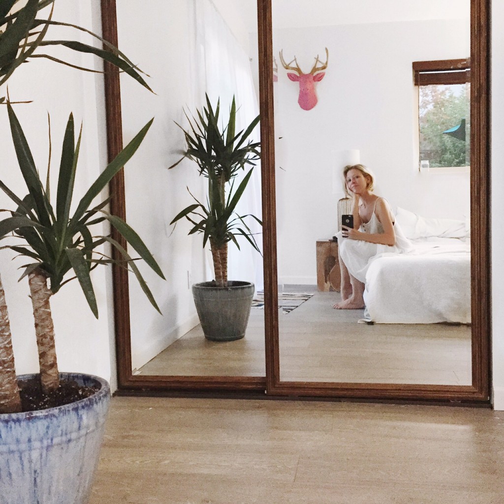
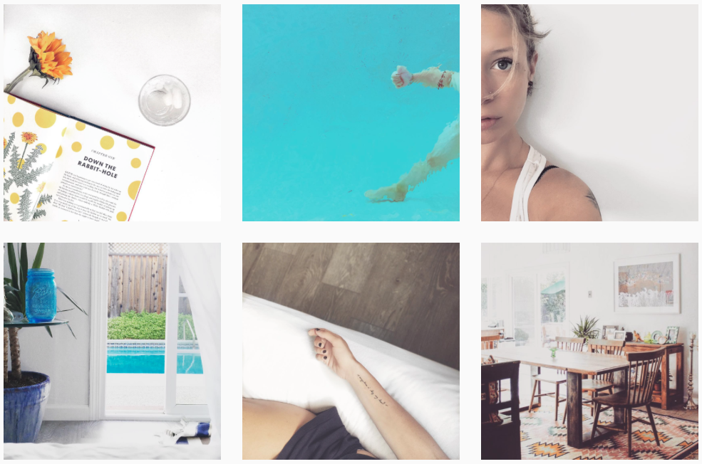
See all that white and negative space? That’s on purpose.
Why I Decided To Make A Change
When I first started blogging, I gave the images very little thought: I knew that posts were typically associated with at least one photo, but certainly didn’t consider image quality or style. My blog was a mishmosh of not-especially pretty Google-sourced images, blurry iPhone photos, and shots that I’d taken with my little point-and-shoot. Once I picked up a Canon DSLR about a year and a half after I started my image quality took a major turn for the better, but still: my photos weren’t great (due entirely to my own limitations, not my camera’s).
For the longest time I thought that was fine, because there are lots of sites out there that essentially look like Vogue pictorials, and that’s something I will never be able to come close to competing with because a) I am not married to or best friends with a genius photographer and b) no one’s going to see a photograph of me and confuse it with a Vogue pictorial, and that’s that. And so I figured, you know what? My site’s about the words, not the photos…and besides, I reasoned, my goal is not to present a picture-perfect, Pinteresty vision of some life that doesn’t in any way resemble my reality. My goal is to talk about Real Life, which looks however it looks. If the photos were in focus and passably well-framed, I figured that was good enough.
And now? I think I was wrong about that.
Not because I changed my mind about presenting a tarted-up version of what my life is really like; I’m still super disinterested in that, because that’s boring, and a lie, and nobody likes boring liars. But the fact is that my site is my business, and the business that I’m in is an intensely visual one. If I want to continue to grow, the fact is that my site needs to incorporate a visual storytelling element as well as a written one. Images matter, because they present a massive opportunity: to engage the reader, to enhance a story, and to communicate what your site is about (your vibe, in other words).
So now let’s talk:
How To Find That Vibe
You know what I think is the best way to start honing in on what kind of vibe you want your photos to communicate (and figure out how to achieve that vibe using framing and editing techniques)?
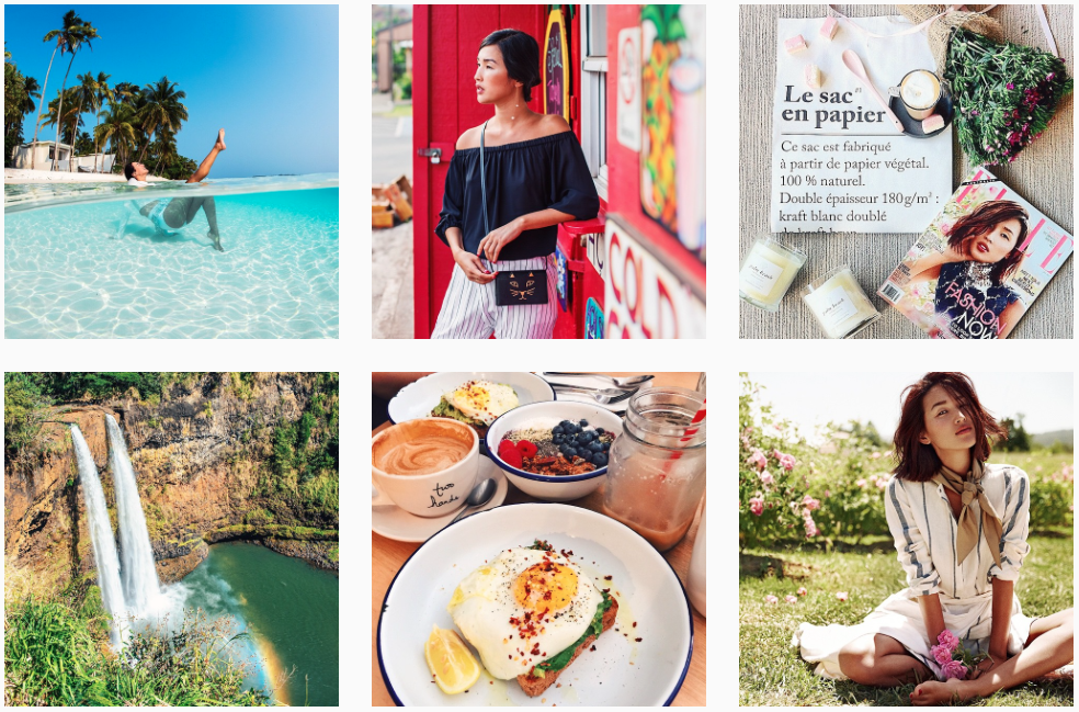
Go hang out on Instagram for awhile. Not to find someone you want to “copy” – the point is to find what inspires you, not to mimic somebody else – but rather to see what kind of general feel you respond to.
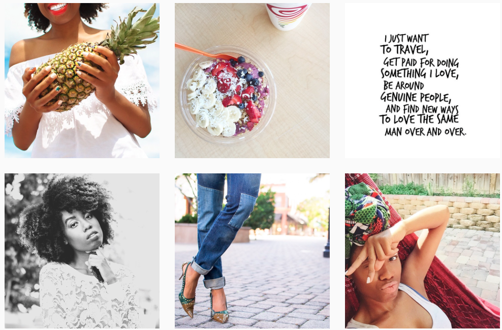
via @thainamadere
Do you love images when they’re bold?
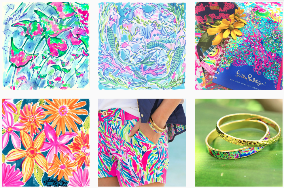
via @lillypulitzer
Or girly?
via @mija_mija
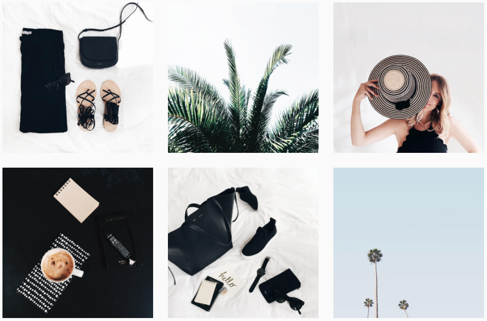
Maybe you’re super-minimalist…
via @garypeppergirl
Or maybe you prefer things a little more lively.
Whatever it is, I think you’ll know it when you see it.
via @ramshackleglam
What I personally like are images that are bright and relatively spare, with a lot of white and negative space. So regardless of what I want to post a shot of – a recipe, a cool new buy, a selfie, a decor image – I look for ways to position the object that I’m shooting in a context that’ll give me the effect I’m looking for. Wherever I go, I keep an eye out for interesting backgrounds, cool textures, and great light. Is it less “organic”? Yes. But it’s also an opportunity to get really creative, and to tell a story rather than just post a shot.
Will I post an image that doesn’t fit in with what I loosely consider my site’s “look”? Of course I will…just not too often. This video, for example? Obviously not especially well-framed or well-lit, but COME ON. Videos like that are what the word “exception” was made for.
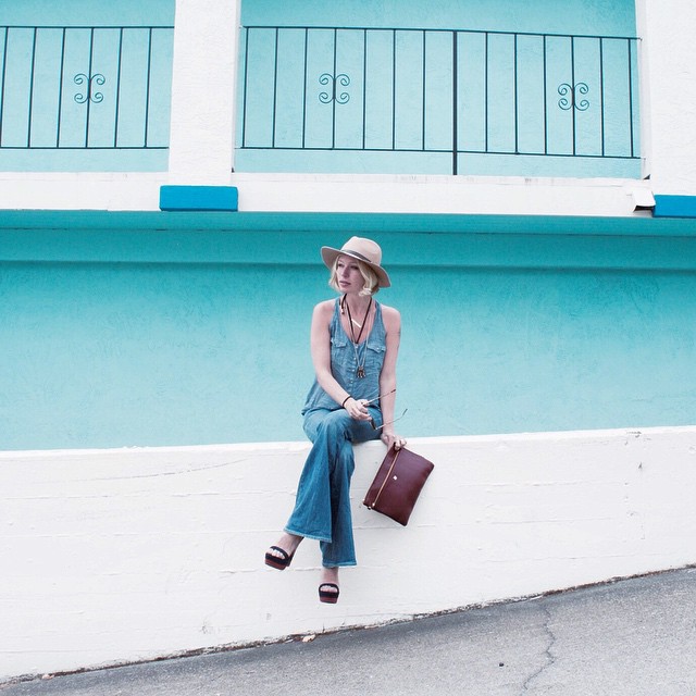
How To Apply Your Chosen Aesthetic To Your Site And Social Channels
– Framing. Do you prefer visually spare images? Or do you love it when a lot is going on in a shot? Consider the entirety of the image, not just the subject; if what you’re going for is a minimalist vibe it won’t do to have a bunch of clutter in the background, even if the object of the photo itself is simple.
– Filters. This is the easiest way to add consistency to your imagery. For the vast majority of the shots I post to Instagram, I use Facetune to lighten and brighten them, which creates a bleached-out effect. For RG itself, I prefer images that have that white, bright negative space, but pop a bit more, so I frequently use the “Chrome” filter on iPhoto, which both brightens the white areas and saturates the color. Play around and see what feels right, and then try to be consistent – as you can see, people really do notice.
– Props & Bulk Shooting. If you’re blogging every day, it can be tricky to keep your photos consistent because reality tends not to concern itself with conforming to your aesthetic requirements. Say you prefer monochromatic images: unless your entire house and wardrobe is black and white, you’re going to have a tough time making your on-the-go shots all neutral. This is where props come in: pick up a couple of large, flat surfaces (I buy posterboards at Michael’s) in your chosen palette; that way you’ll always have them handy to use as backgrounds. And if you find yourself in a situation that’s particularly well-suited to your style – say you’re at a party decorated with patterns and colors that you love – don’t be afraid to bulk-shoot and hold on to some images for posting later.
– Google Images. Even if you grab an image off of Google, make sure that the one that you choose is in line with the overall look of your site. I’ve had the best luck finding quality images when I add the word “Tumblr” after whatever search term I’m looking for. Don’t know why; that just seems to be the case.
– Pickiness, Generally. If you’re really looking to make a major change, now is the time to get super picky. Even if you love a shot in a vacuum, if it’s not the right look for your site, go ahead and share it with your friends and family, but don’t post it to your blog. It’s true, so much of this industry is about self-expression, but still something to be said about being able to step back and look at your work objectively, and make a decision not just based on what you like…but what’s best for your business.
One last thing: so what if you put in all this work, and still feel like your imagery isn’t quite where you want it to be? Remember that learning any new skill takes time, and a hell of a lot of trial and error. The simple fact that you’re actively looking for ways to improve and working to take steps forward is huge. Huge. It’s that kind of effort that separates the people who dream from the people who do. Trust me on that one.
