I don’t think it’s any secret that our whole house has been a work in progress since the day we moved in.
I didn’t approach decorating with a razor-sharp idea of what I wanted things to look like, and certainly didn’t have the budget for a top-to-bottom, all-at-once redo…and besides, that’s never really been what I’m into when it comes to decor. I like seeing how things evolve over time, as we discover more and more about the house and how it fits our family. This has worked out well in some cases – as an example, we left the attic empty for several months, and ultimately realized that it would (and does) make a beautiful playroom. In other spaces, my not-so-rigid approach has resulted in me having to back up and reconsider fairly major elements that I had thought I was set on.
Which is fine, I think; that’s just how it goes. But it has taught me a pretty handy trick for how to approach whole-room redos with both foresight and flexibility.
Let’s discuss.
The living room has always been the most challenging space for me in our new home, mostly because when we moved in I knew that most of the furniture from our old apartment would end up going elsewhere in the house, and that level of starting from scratch is something I find…a little intimidating, I guess.
It felt like such an opportunity to create something really beautiful and personal. I wanted it to feel like me, like us, like home…but in my head, the picture of what all that might look like wasn’t exactly clear.
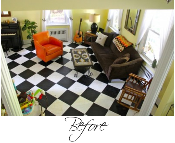
This is more or less how the room started out: with black-and-white floors that were very cool-looking but in terrible shape, a whole bunch of hand-me-down furniture, and walls that I painted yellow a few days before we moved in because I wanted the room to feel sunny and bright.
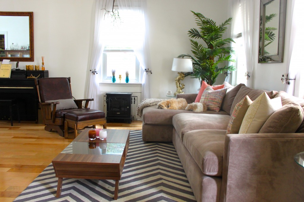
We’ve since replaced the floors, picked up a new couch and a new coffee table, and swapped out that orange chair for a very cool thrift-store rocker/ottoman combo. I’ve spent the past few months playing around with everything from colors to styles to furniture placement, and writing about the ways that we’ve changed stuff and whether it’s worked or not on RG…but still: no matter what I did, something about this room just felt…off.
Like nothing I put in or took out was making it come together quite right.
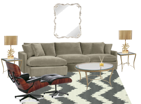
And I had a suspicion what the problem might be, but I didn’t want to admit it to myself that I’d made such an annoying mistake…so I made a Polyvore board and imported images of all the pieces we owned (including our new couch and an approximation of our thrifted chair).
It looked…not great, but…you know, fine.
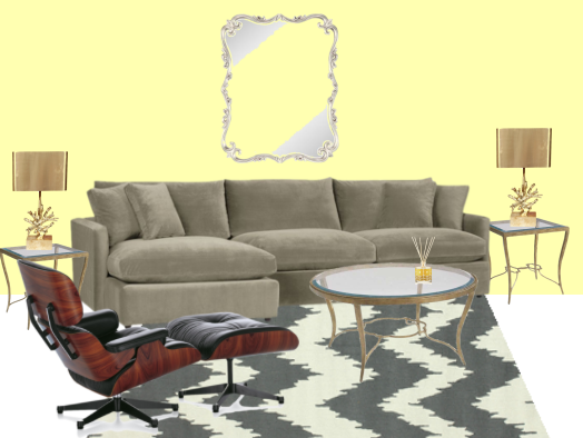
And then I put a yellow background behind the images.
Oh.
Bad.
As it turns out, I was correct in my suspicion that I’d made a truly annoying mistake: it was my yellow walls that were throwing the whole room off. As time went by, you see, what I learned is that the colors and patterns I was gravitating towards for furniture and accent pieces just straight-up didn’t go with the yellow.
But you know what?
It’s just paint.
And decor-wise, I’d rather try interesting things and have them turn out not to work than never try anything at all.
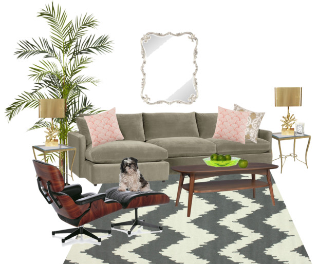
Next step: figuring out what direction to go in so that this little mistake I’d made didn’t repeat itself…so back to my little inspiration board I went. I knew I wanted the space to feel airy and light, and I had a fantasy of pale walls with dove greys and dusty roses and green plants and gold sprinkled anywhere and everywhere.
Sort of like a chilled-out version of a 1950s Palm Beach hotel room.
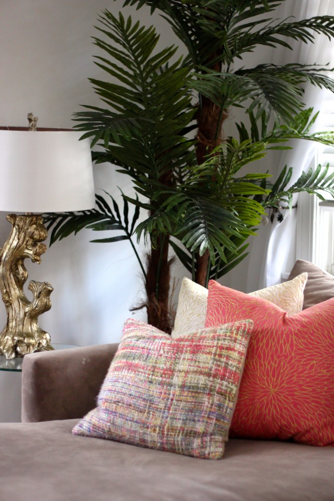
Leaving in place the pieces we already owned, this is what I came up with (that’s supposed to be Lucy, if you were wondering), and so on my next few trips out and about I kept this mockup in mind. I bought a couple of gallons of paint in a cool shade of white (oh my god, there are so many shades of white to pick from). Next, I found an amazing faux plant at HomeGoods, some rose and ivory gold-laced pillows at T.J. Maxx, and some gorgeous rainbow throws at Crate & Barrel.
Finally, I moved a few things we already owned – a pair of hand-dyed blue Mason jars filled with lavender and some multicolored candles – around to bring even more color into the space.
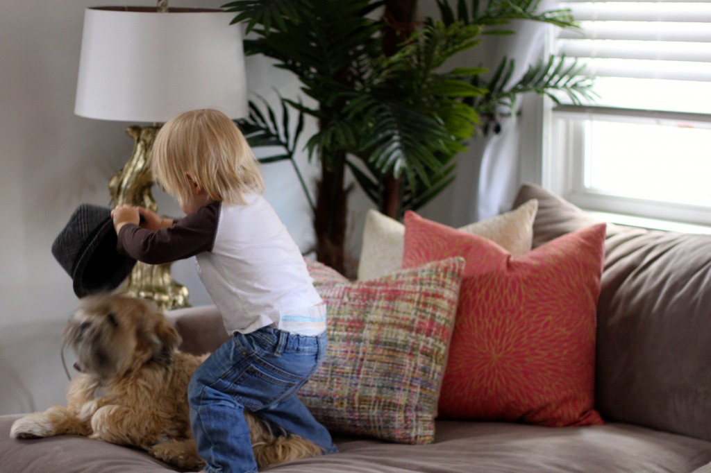
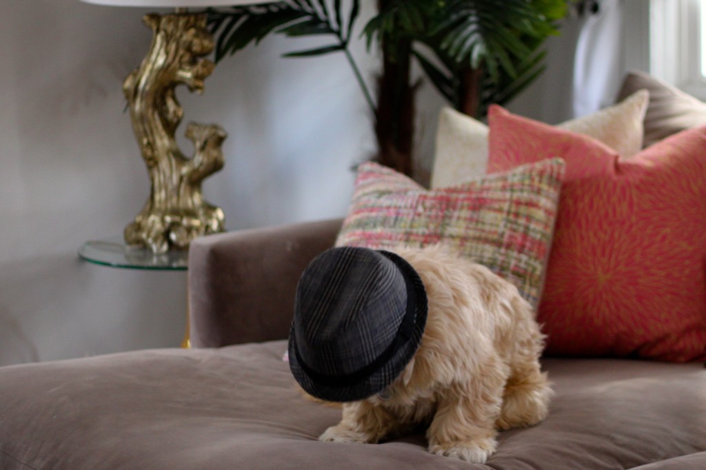
The excitement was apparently enough to inspire some of us to put hats places where they shouldn’t go.
Oh, dear.
Is it done?
I don’t know, I’ll probably never be done. I continue to have fantasies of hot-pink throw blankets, lampshades that aren’t white, chandeliers, and zebra-print rugs. Oh yeah, and our coffee table (which was cheap, so I was kind of expecting this) is falling slowly to pieces, so there’s that.
But really, that’s what’s fun about the whole thing: watching your home evolve right along with you, fitting into and around your family’s lives and they shift and change and grow.
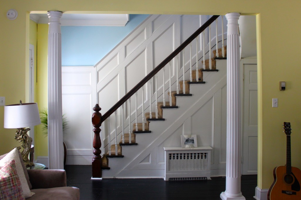
(I did leave the yellow in the foyer and on a single accent wall; I just love that color, and I couldn’t resist.)
Pictured here: Crate & Barrel Lounge 2-Piece Sectional Sofa in Fawn; lamps, side tables and plant from HomeGoods; throw pillows from T.J. Maxx (pink and ivory) and Crate & Barrel (rainbow); nuLOOM chevron rug; thrifted chair and ottoman; thrifted and rehabbed piano; Kress Glass Insert Coffee Table.
