via A Beautiful Mess
Blogger homes really stress me out.
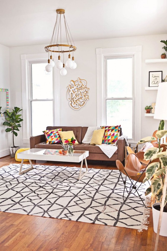
They’re all fiddle leaf figs in adorable woven pots and white carpets that my dogs would destroy instantly and lamps that I can’t afford and perfectly arranged gallery walls of expensively framed prints that look like they were collected during a succession of impossibly glamorous round-the-world trips.
I can’t do it.
Take my closet, for example: I’m in the middle of shooting a closet renovation segment with Thumbtack (you can check out my previous segments here, if you’re interested), and I’m aware that for the “after” shot, according to Blogger Rules, I’m supposed to have all matching hangers so that the finished product looks perfectly chic and clean and magazine-layout-y…but I don’t want to.
One, because for whatever reason hangers are stupid-expensive, and I need about three thousand of them, and two, because I don’t really see any enormous value in putting up photographs of a closet that’s not what closets actually look like (or maybe yours is filled with perfectly matched hangers, but if that’s the case you most definitely don’t need my advice on…well, probably on anything at all, but certainly not on closet organization). I’d rather show what a real closet in the real world looks like, so maybe you can actually take some real ideas from it (or give me some ideas of your own, because I can always use them).
You know?
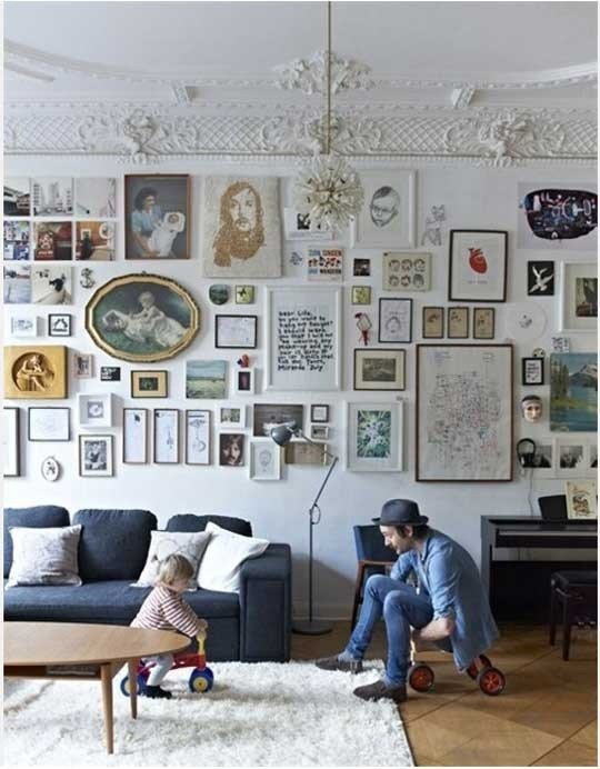
Ugh, this is great. Although I’m calling BS on people with a toddler owning (or at least maintaining) a rug that white. (via Apartment Therapy)
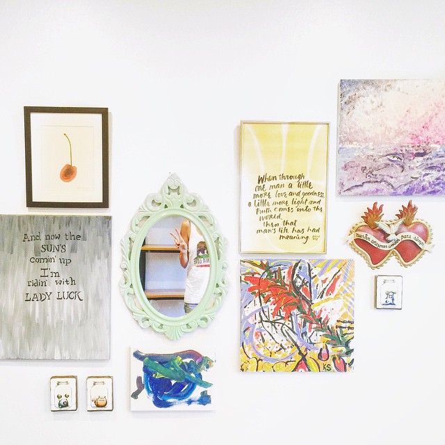
And back to those gallery walls. I do love them, but I don’t exactly love them because they look cool (although they do): I love them because they offer a way to display a collection of stuff that matters to you. When we were unpacking post-move I piled all of our wall hangings into one room to take a look at them, and I discovered that the pieces I love most weren’t the “nicest” ones – they were the ones that told a story. Some of them are even straight-up unpretty…but pretty isn’t exactly the point.

And so here’s what the gallery wall that I assembled in my son’s bedroom looks like. There’s those paintings that Kendrick and I did on our honeymoon, a painting by a dear friend, a painting that Indy made himself, a poster that used to hang on my grandparents’ wall (one of my all-time most cherished possessions), and a tin sign we found at a street fair a few weeks after we got engaged. It’s not especially chic; it’s not especially fancy; it’s just stuff we love to look at.
And I think that’s exactly what a gallery wall – and a home – should be.


