Our Home Editor, Audrey, takes us on a tour of her gorgeous living room, decorated in calming neutral tones and textures.
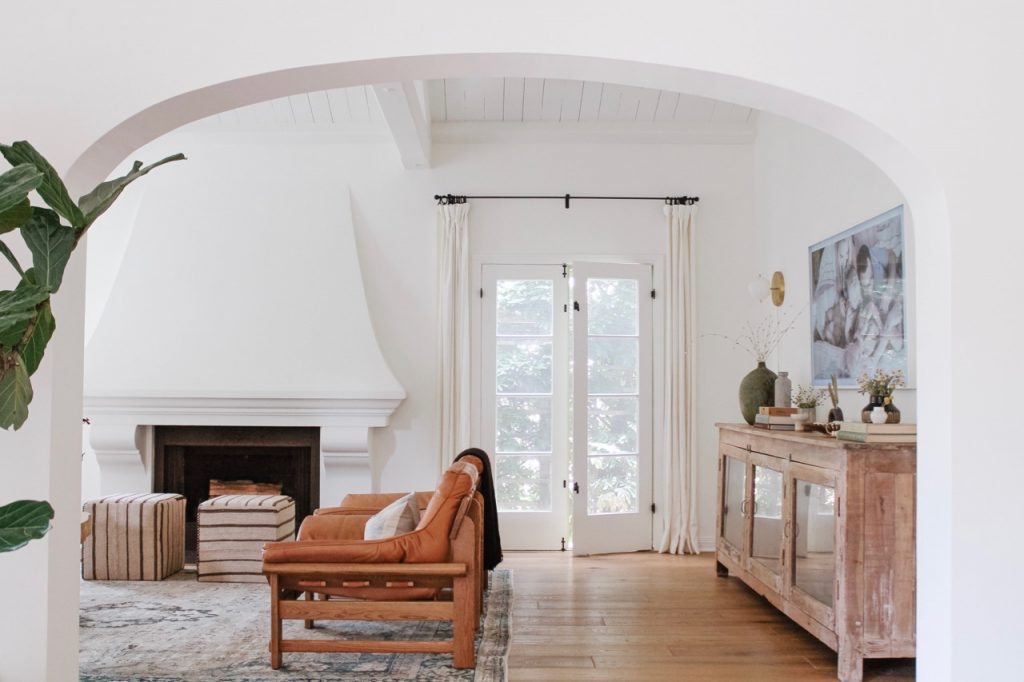
Welcome to our living room! While it’s the least-utilized space in our house, it's certainly my favorite from a design perspective. The living room was a huge selling point when we first saw the house back in February of 2019 – I knew there was potential the second I saw the large windows and vaulted ceiling. I also quickly realized that the layout of the room would be tricky.
The living room is long and narrow, with a fireplace in the middle of one wall, a large, arched window in the middle of another, and the entrance to the dining room dominating a third. There was only one wall that could possibly be used for a television, and it took us months to figure out a seating configuration that made sense based on the location of the TV. To make things easier, we chose a television that doubles as art when you aren’t using it.
During renovations, we did several things to the living room that made it feel more updated and workable: we painted everything white (including the vaulted ceiling beams!), removed all of the track lighting, added 4 wall sconces, laid new hard wood floors, and updated the tile in front of the fireplace. This gave us a fresh start as we started to bring in furniture and décor.


