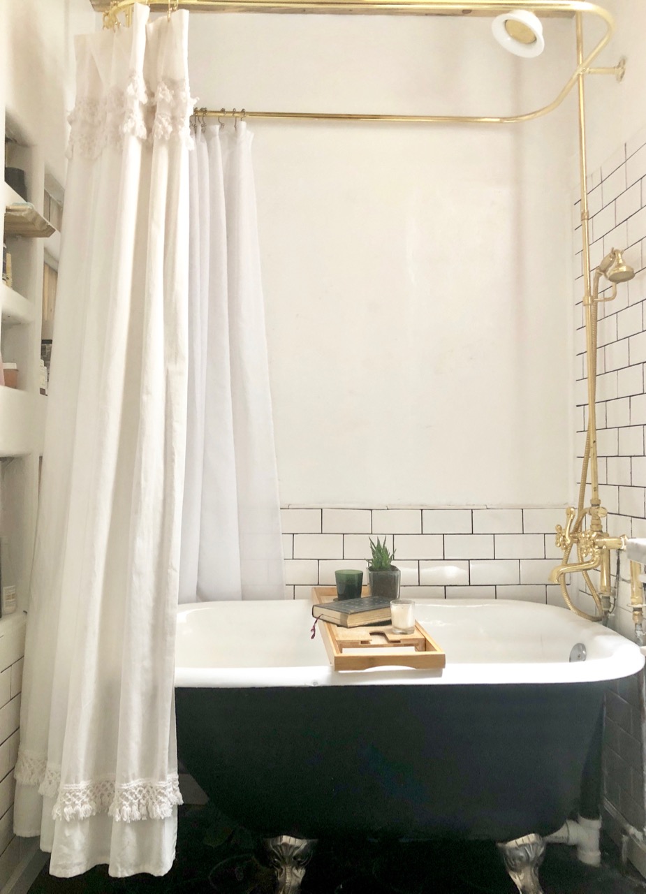
IT’S DONE.
I love, love, love, LOVE my bathroom. I say “my” bathroom even though it’s the bathroom in the hall (as opposed to the master bathroom) because from the time we moved in it was the only bathroom with an actual bath in it – and we all know how I feel about baths. So while it was the kids’ primary bathroom, too, I sort of adopted it as my own.
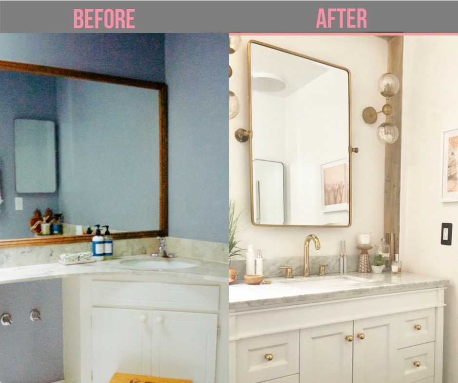
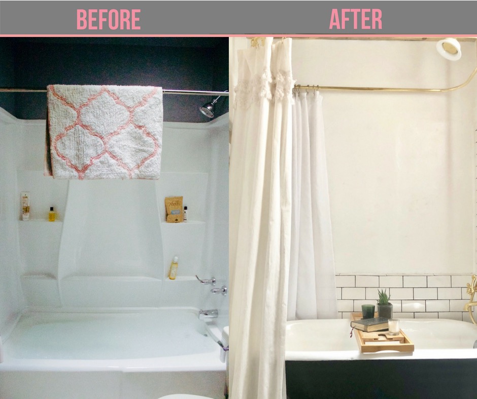
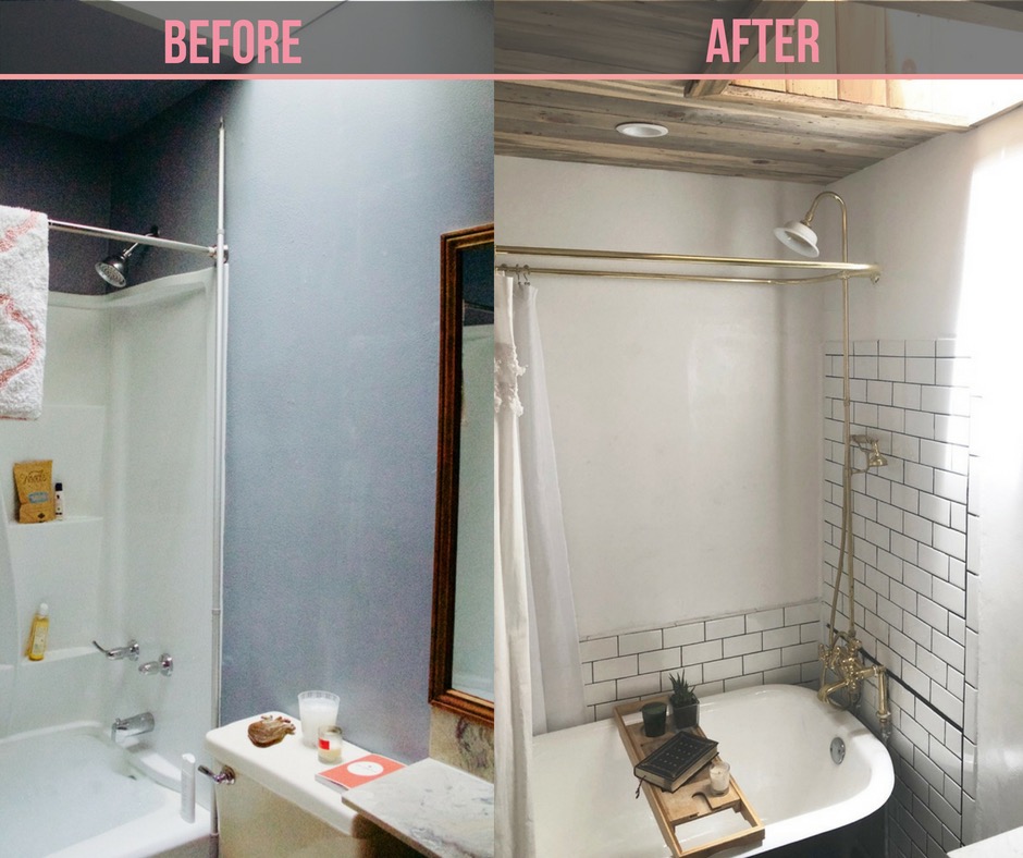
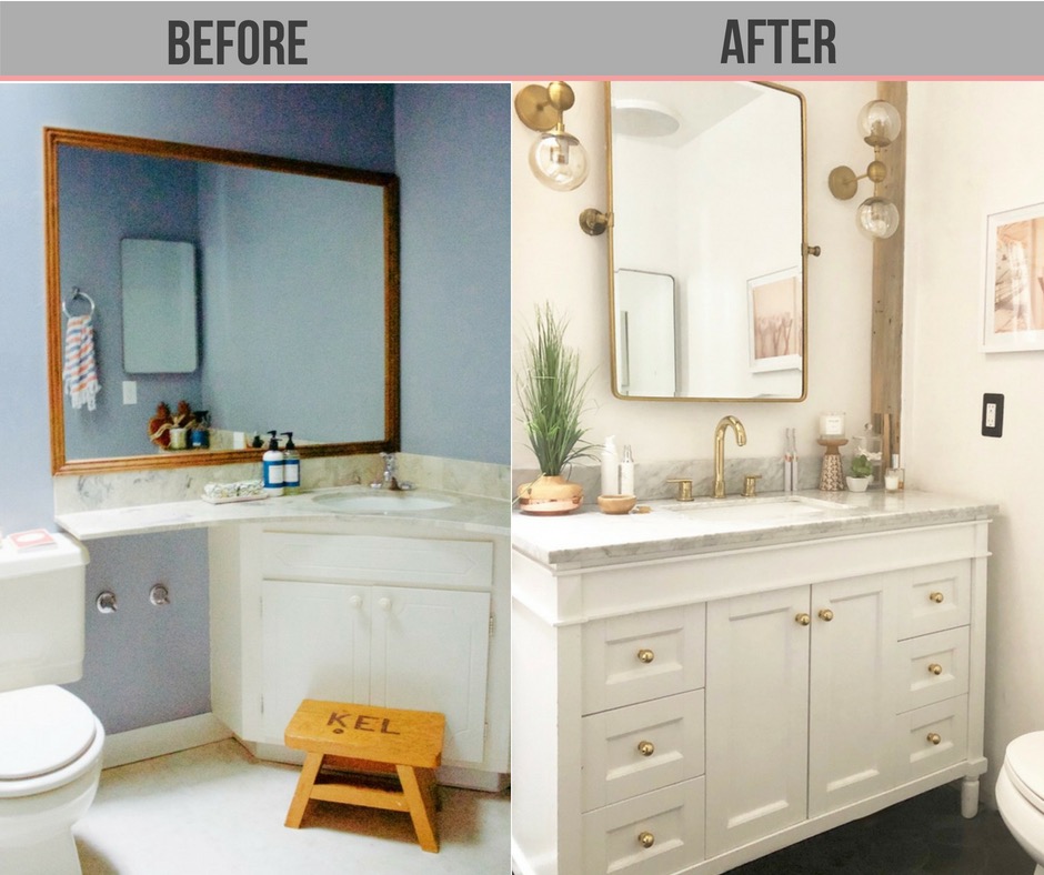
When I set out to renovate this bathroom (before and after pics are below, but you can take a look at what it looked like when we moved in, and then it’s first evolution before the major renovation here), I wanted to make sure that it worked for the kids…but I also thought, what the hell: I’ve always felt like my bathroom is my sanctuary. So if I’m going to put in the work to fix it up, I might as well go ahead and make it everything I’ve ever dreamed of.
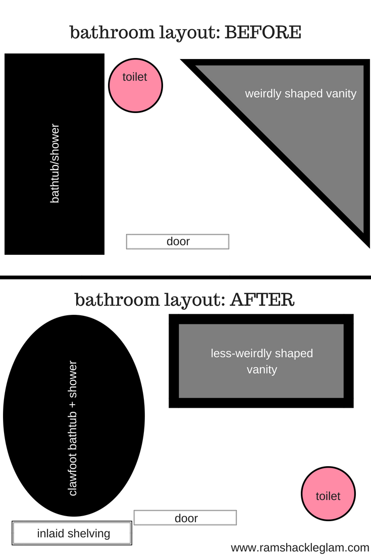
First, the floor plan.
I’ve always gotten the icks from taking a bath right next to a toilet, so my first priority was to figure out how to get the damn thing away from my bubbles.
I took detailed measurements and played around with arrangements for the three main elements (tub, vanity, toilet), and found that the only real place where I could make the toilet fit (and not be next to the tub) was across from the vanity. We ended up knocking out the wall behind the vanity and moving it back about 4″, which gave juuuust enough leg space for the toilet.
Now let’s break down all the specifics, whee!
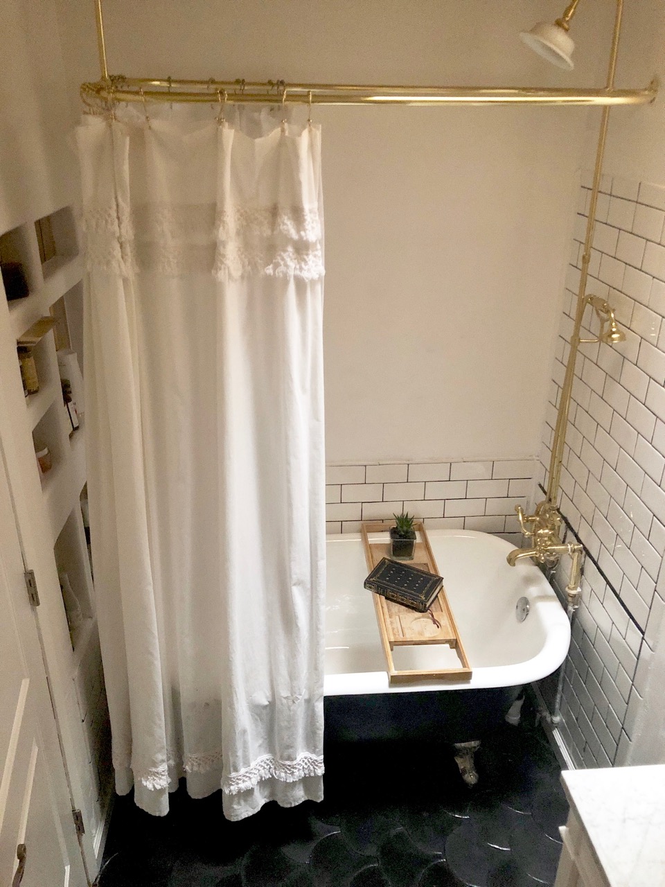
Black fish scale tile, YES.
THE TILE
While I was doing initial research, trying to figure out the overarching bathroom style I wanted to go for, I found this bathroom on HomePolish and thought…oh. Yes. All of that, please, starting with the black fish scale tile floor. Villa Lagoon – the same company that made the tile in our entryway – offers a fish scale style in encaustic cement, and you can choose from in-stock shades, or create a custom order in any color you want (black, plz).
I wanted it to be super glossy, so after laying the tile and sealing it with regular bathroom floor sealers, I added several layers of a high-gloss sealant. I know this makes me sound very fancy and professional, but sealing tile is actually a pretty unscrewupable process, as home renovation projects go – you just have to be super careful to keep the floor completely dry while sealing, because any water droplets will create spots on the tile.
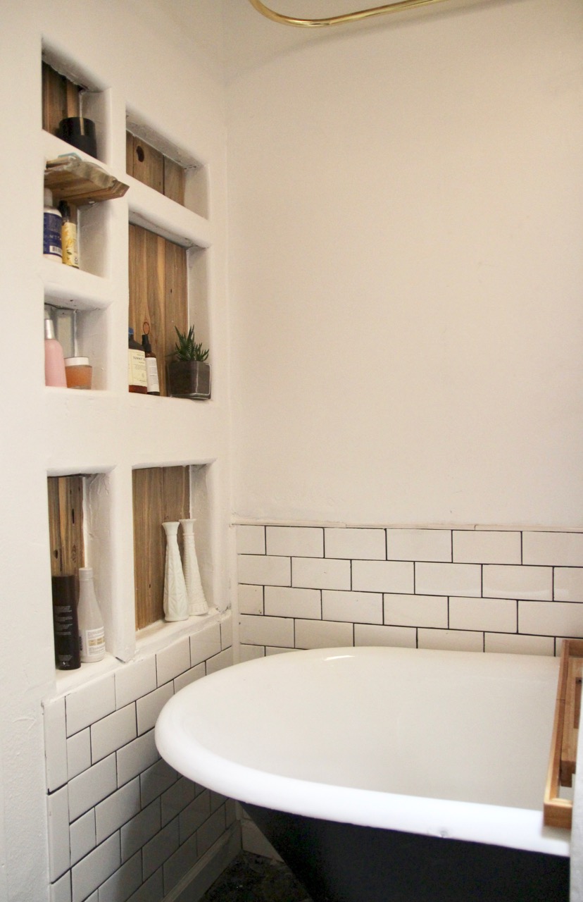
On the wall around the tub, my plan was to go for white glass square tiles (not white all the way through, more like transparent with a white back), and then I discovered that these specific tiles are confusingly expensive, and subway tiles are confusingly inexpensive. Yeah, the white-subway-tile-with-black-grout look is a little overdone – you see it everywhere these days – but I feel like it’s jumped into “classic” territory, and think it created some nice graphic contrast in the room. (The massive grout line you see is a mistake; the floor wasn’t level, and so the tiles weren’t lining up in the corner; I had to use a level and start a new tile line so that they’d meet where they emerge from behind the tub. I’m also going to neaten this part up a bit, but got too impatient to wait any longer to show you this renovation.)

THE FURNITURE
I spent months puttering around on various bathroom furniture sites, looking for one that had the balance of design, price, and quality that I was looking for, and ended up discovering Signature Hardware. The tub was my first purchase from them, and I ended up getting pretty much everything for our other bathroom (which will be done soon) from the site.
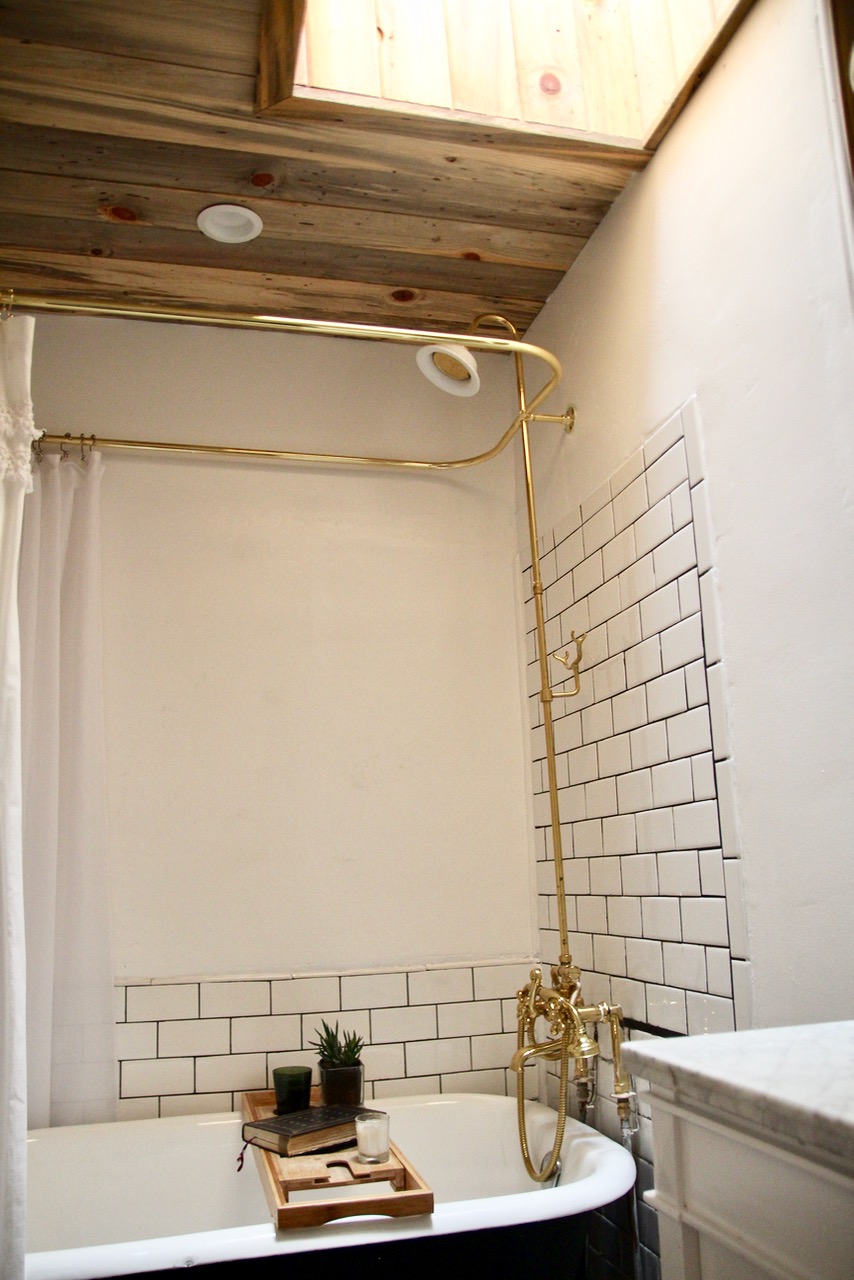
Oh my god, I love this tub. I’ve always dreamed of having a clawfoot tub, but my bathroom was too tiny for a traditional one. Enter: the Miya Black Slipper Clawfoot, which is only 54″ long and tucks neatly into a smaller space. (And if you’re wondering, yes, it’s totally comfortable for a me-sized adult – plus, the kids love how deep it is.) And, of course, no clawfoot tub is complete without a polished brass shower kit with vintage-y hand shower attachment.
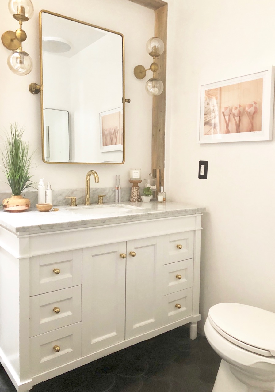
For a vanity, I went with the one that you guys overwhelmingly voted for in this post: the Tiffany 48″ with a single sink and a marble top. (I didn’t love the handles, so I replaced them with simple brass ones.)
THE CEILING (and wood detailing)
I love my contractor – Todd von Kaenel at Dynamix – so much. I mean, I better: we’ve been basically living together for the past eight months. But having worked with tons of different contractors over the years, there’s something really amazing about finding someone who really gets your style, and is willing to experiment and have fun with the process.
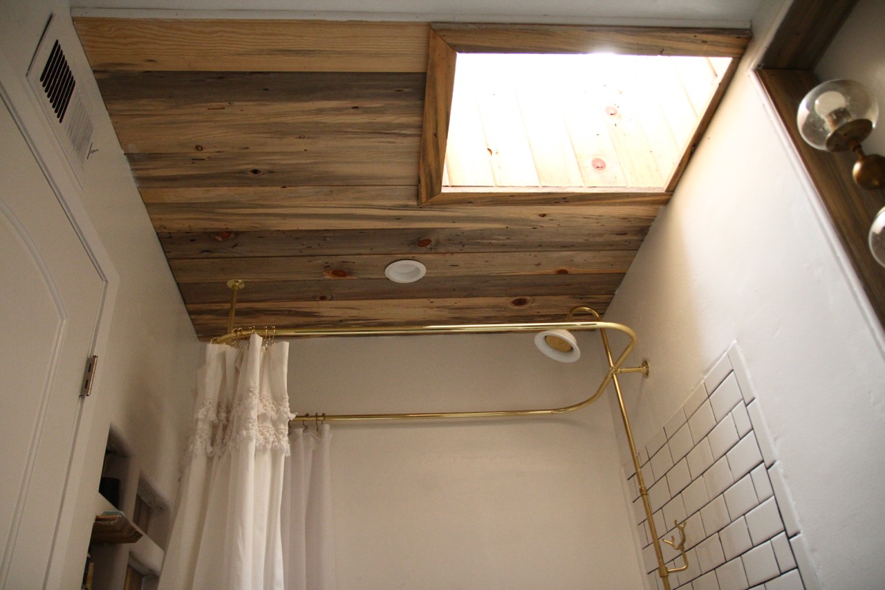
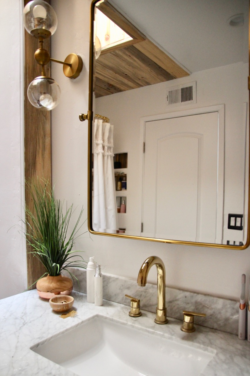
Todd and I had talked about adding wood elements to the ceiling to offset all the glam black/white/gold stuff and give it a rustic vibe (and also to line that weird tunnel-like skylight, thereby transforming it into a design element as opposed to something that looks kind of like a mistake) – and he not only found the exact wood I was looking for, but then added little details – the backs of the inlaid shelving and a frame around the mirror – without even having to ask me, because after working together for so long he knew I’d love them.
Spoiler: I did.
THE FIXTURES AND DETAILS
Finally, a quick rundown of all the remaining details I added:
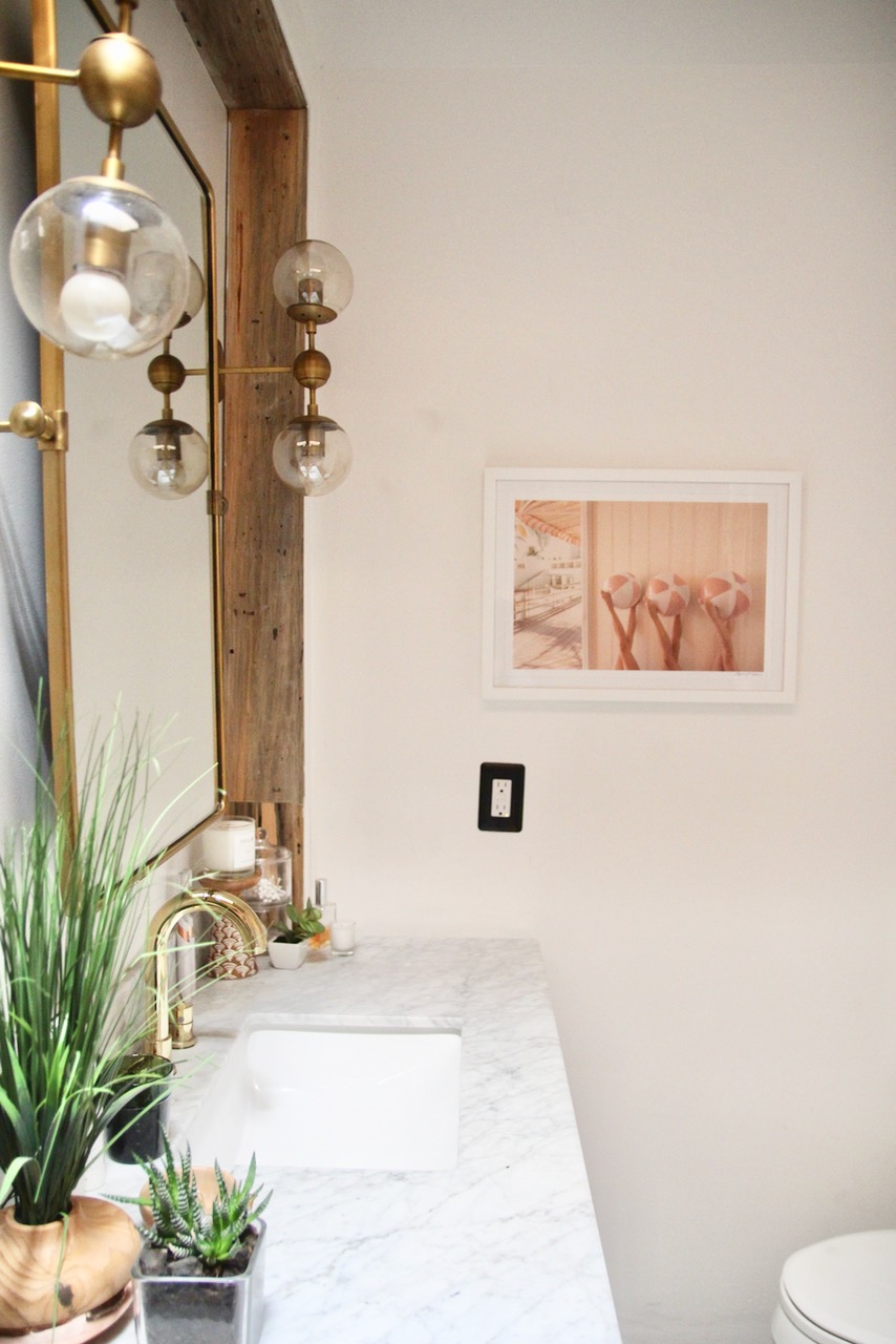
- Polished brass gooseneck faucet – which, as an aside, is not easy to find at a reasonable price point; the one I purchased was virtually the only semi-reasonably-priced one I found for this particular style.
- Gray Malin beach ball print from the Coral Casino collection (a gift from Gray).
- Fringed shower curtain: The one I bought is no longer available, but this one has a similarly feminine vibe.
- Black switch plates: Cool, right???
- Vintage Pivot Mirror: No storage, alas, but when a mirror is this gorgeous, my feeling is that’s what drawers are for.
- Double Globe Sconces: Possibly my best find, these are knockoffs of verrrry expensive midcentury globe fixtures…and, having checked out both, I like these better. One caveat: the mounting plates are a little smaller than traditional ones, so if you’re replacing an existing light fixture with these, be aware you might have to patch the drywall around them for a clean look.
So there you go. Before and after picks are below. If you have any questions, feel free to ask away!
