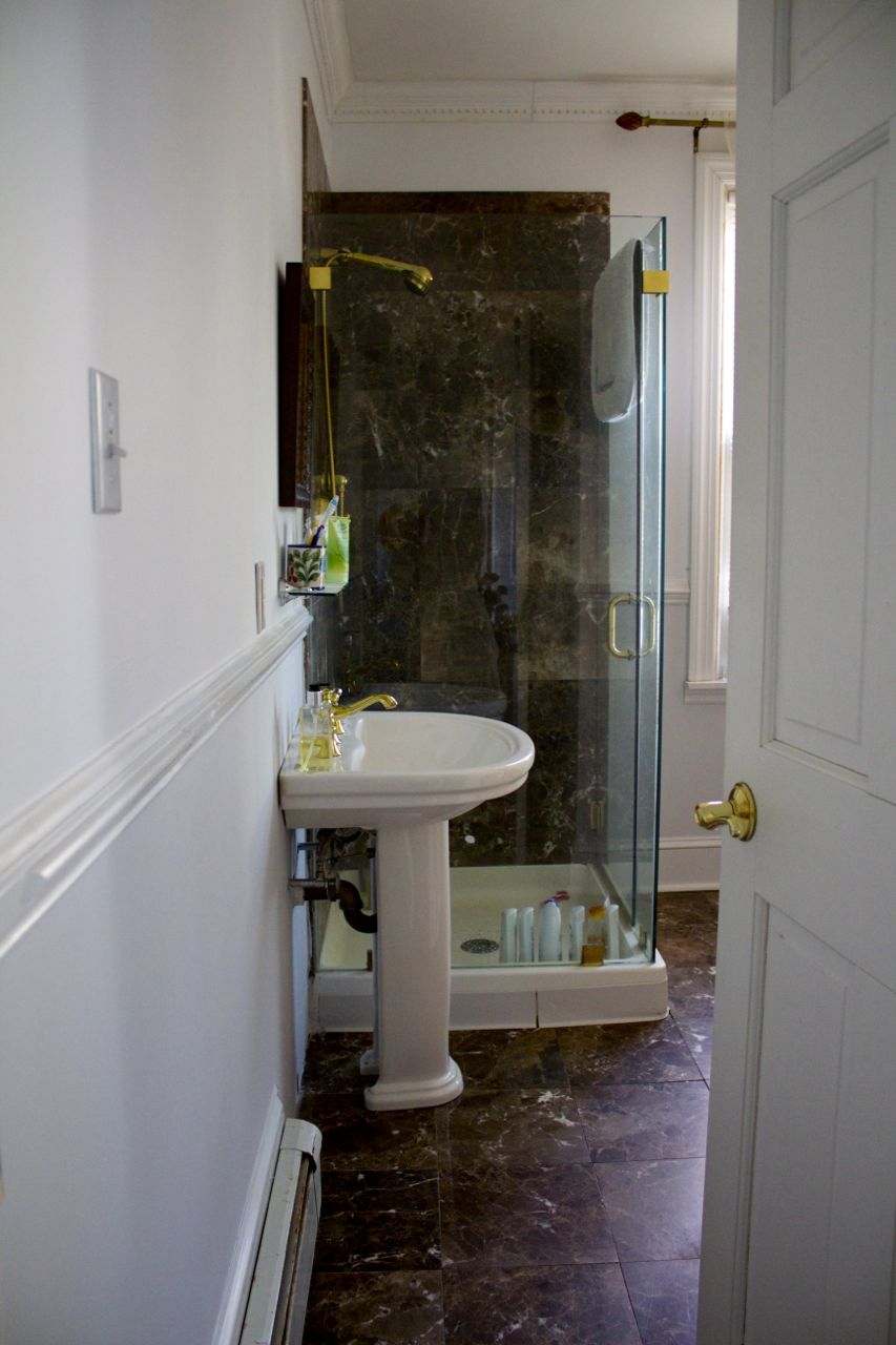
Bathroom before (you can’t really see the water damage here; it was under the sink and got worse after this photo was taken)
Alright, so…
this didn’t really work.
A few months ago, our upstairs shower leaked, which meant both that water came down into our living room and we had to repair the living room ceiling, and that part of the wallpaper in the bathroom had to be ripped out. Which was sort of a shame because that was one room in the house that really didn’t need any updating – the previous owners had just repainted and re-wallpapered shortly before we moved in – but was also kind of a neat opportunity to do something new, because as much as the bathroom didn’t “need” fixing-up…I wasn’t a huge fan of the look of it.
I’m just not really a “champagne-walls” kinda girl, and think small spaces like bathrooms offer such an opportunity to do something extra-cool. In a perfect world, I would do a pink-and-black 1950s look, but getting Kendrick on board with that one might take some work. Also: a full redo with tiling and new appliances would be crazy expensive, and my priorities at the moment are more “upkeep” than “overhaul”.
Still, I had all sorts of smaller-scale ideas, including putting in a slipper tub (which we turned out to not have room for) and installing art deco-style wallpaper (which would have ended up costing more than I had budgeted for various reasons), and so I ultimately decided to just make life easier on myself by removing the existing wallpaper and repainting the room in two different shades of grey. I thought it would be calm, and chic, and let me add (and change) color with towels and accessories (because pretty much anything works with grey).
And because I never, ever learn, I only tested the paint colors I’d chosen on one wall, rather than doing what you’re supposed to do, which is trying them out on all the walls to see how the light hits them differently.
And I don’t hate the results…but…well…

Bathroom after (view 1)
Eh.
That’s not exactly the contrast I was going for.
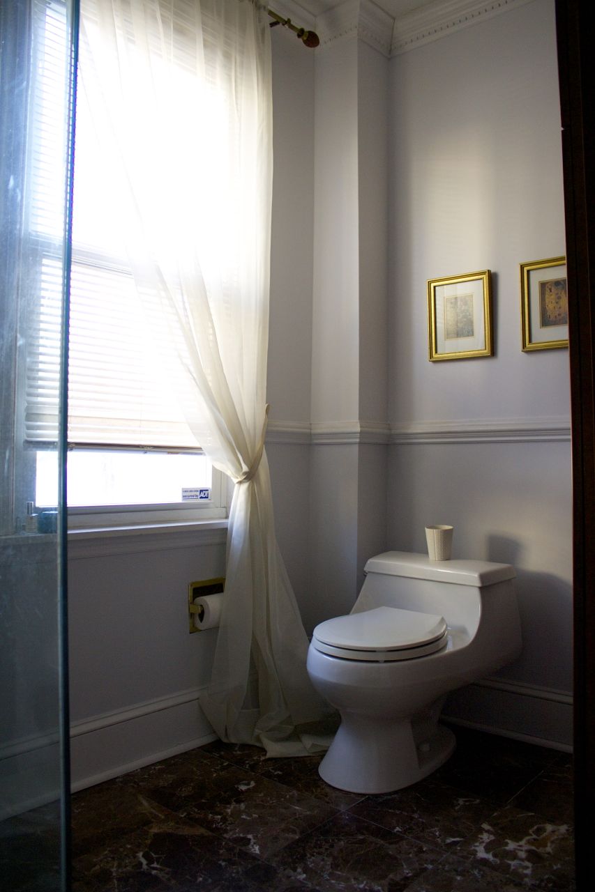
Bathroom after (view 2)
It looks more like what I’d intended over here, where the light is different…but on that first wall it basically just looks…white. And not especially interesting. So I basically replaced bland-beige with bland-grey.
Urgh.
But it’s also not terrible, just not spectacular; I think some dusty rose or sage green towels and accessories (plus a little plant life) would add a lot. (It’s also just paint, and I can change it later, but like I said: it’s not super-high on my priority list right now what with the baby due date and the book deadline coming up. I’ll get around to it eventually; in the meantime, I’ll file this one away under yet another lesson learned.)


