(I love this video: it reminds me of Edward Scissorhands and gives me chills.)
My relationship with art is fairly straightforward: apart from an oddly comprehensive knowledge of Michaelangelo thanks to a very specific course I took in college called, yes, “Michelangelo”, I have next-to-zero “technical” knowledge about art…but I definitely like what I like, and I know what I like the moment I see it.
What’s hanging on our walls right now: everything from a $30 print we picked up at the Union Square market years ago to a wooden Balinese headboard we bought on our honeymoon to a vintage Coca-Cola sign inherited from my parents. The only thing that all of our pieces have in common: I love them. They make me happy every single time I look at them, and I honestly couldn’t care less whether they’re fancy, or cool, or would hold up to an “expert’s” ideas about what’s “good” and what’s not.
And I really, truly believe that that’s what art should do: it should make you love your space that much more.
Remember a couple of weeks ago, when I went to San Francisco? The purpose of the trip: a summit with a bunch of other bloggers to celebrate the launch of Art.com‘s redesigned site. The purpose of the redesign: to make the experience of finding art that you love fun and exciting, no matter your budget or knowledge base (in fact, one of their key messages is “To rid the art world of risk, anxiety, and snobbery, one piece at a time.” I love this so much).
How do they do this? They’ve taken the old site (which offered anything and everything art-related you could possibly want…but was a little overwhelming) and made it infinitely more inspiring and easy to navigate. We’re talking curated collections (I’ll be curating a gallery at some point over the next few months, so stay tuned), tools that enable you to mount your picks on virtual walls (you can even import an image of your own space) so you can see what they look like “in real life”, and suggestions organized by inspiring spaces (like “Wanderlust Morocco” and “Modern Man Cave”).
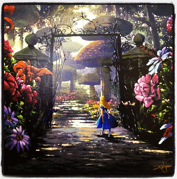
P.S. Want to see the piece that I chose as my contribution to the blogger gallery at the summit? It’s the above limited-edition stretched-canvas Rodel Gonzalez, and is called “In The Garden” – I chose it to hang in the foyer of our home-to-be, which I’ve referred to from Day 1 as “The Alice In Wonderland House.” True story.


