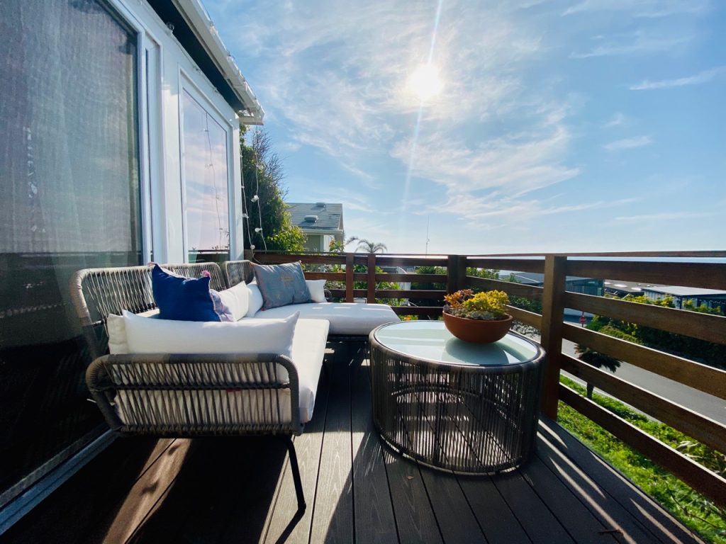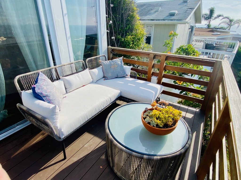
sunset with my loves
CLEARLY the point of living in Malibu is to enjoy all that beach-adjacentness as much and as often as possible, which means creating a lovely outdoor space was fairly high on my priority list from the second I moved in. I got rid of all of my outdoor furniture when I moved – it was so old that moving it would have been more expensive than it was worth – which left me in the market for some new stuff. But my wraparound deck situation perplexed me a little. It’s very long, and quite narrow, and the only area big enough for a table is next to the front door.
Here is where having a friend like Audrey is a blessing from the home decorating gods: I asked Audrey what she thought I should do with the deck, and do you know what she sent me?
Suggestions for three distinct areas, along with a comprehensive list of suggested items at a variety of price points. Because that’s just how she rolls.
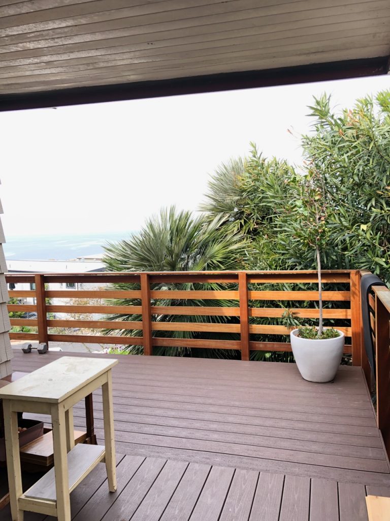
Before
SPOT 1: THE DINING AREA. This is the only part of the patio that’s really wide enough for a dining table, so I cut back as many plants as I could reach to open up the space (and enhance the view). I also strung white icicle lights around the dining area to make it feel distinctive from the rest of the patio.
Audrey’s Furniture Suggestions (with my notes in italics):
- IKEA wood table + IKEA 2 green end chairs: So affordable, and I adore the muted shade of green.
- OVERSTOCK 2 black rope end chairs: At $260/pair, these feel a little pricey, but I’m keeping them in mind for future interior chairs.
- WORLD MARKET table, bench, and chairs: Clean and classic – perhaps a little *too* classic for my taste. I need a little weirder 🙂
- WORLD MARKET white / wood table and benches: One of my top two picks – the color of the wood is stunning, and I love how the white base lightens it up.
- WALMART wood rectangular dining table + chairs: Surprised that this adorable white table and chairs are from Walmart!
- WALMART wood/metal dining table: A bit too heavy and modernist for my taste.
- TARGET black table with thin legs: Sleek and minimalist, but I didn’t want to do black.
- TARGET wood dining table: Love the color of the table, but not so much the angled legs.
- TARGET wood/metal with chairs + bench: Another classic, lovely set that’s a bit too classically lovely for me.
- Christopher Knight wood/white table + benches: Aaaaaand we have a winner.
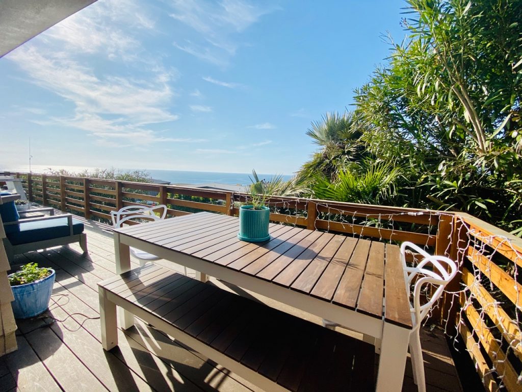
What I picked: This dark-topped wood table with white legs, plus two matching benches. On either end, I put one of the Craigslist-sourced vintage chairs that used to sit around our kitchen dining table (the kitchen dining table we have here is smaller, so we had extras).
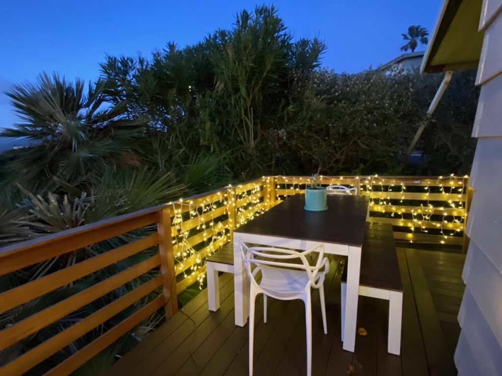
Here’s what it looks like at night. Love.
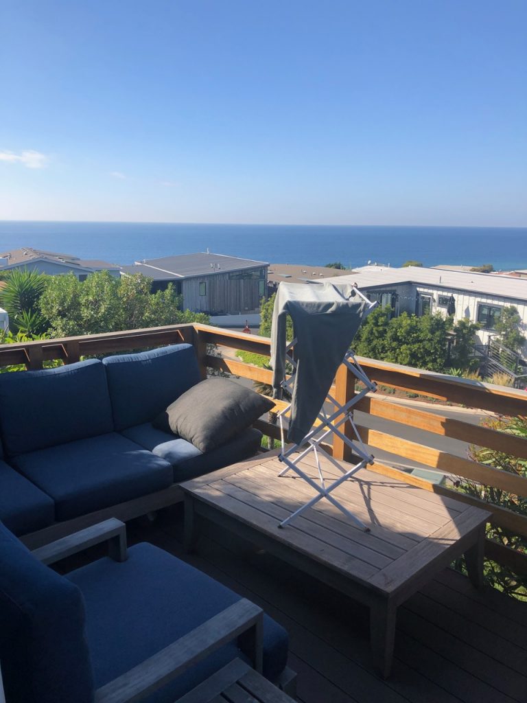
Before
SPOT 2: THE LOUNGING AREA. The owner of the house left his furniture (pictured above) in this spot for awhile, so I took my time finding the just-right piece. This is clearly the best seat in the house, so I wanted the seating to be angled towards the ocean.
Audrey’s Furniture Suggestions (with my notes in italics):
- IKEA white metal frame + white cushion chairs (also has a loveseat): I absolutely ADORE this set. It’s just too expensive when you put all the pieces together.
- IKEA wood frame + ivory cushion chairs (also has a loveseat): This set was a little too basic for my taste.
- OVERSTOCK modern black chairs: I love love love these retro round chairs, and may add them to my exterior (or interior) at some point.
- WORLD MARKET wood frame + white cushion chairs (loveseat also available): The cool, brutalist shape of these offsets the otherwise classic vibe. But they’re too expensive for me.
- WORLD MARKET wicker chairs: Ayyyy, these are cute. But I worry about how durable they are (because children).
- TARGET woven natural/gray chairs + loveseat: I like the grey as a slightly smarter alternative to white, as well as the open construction.
- TARGET natural wicker chairs: Style-wise, this whole set is among my favorites. I just don’t know that they’d stand up to rain (and we do get our share of it).
- TARGET white/coral set: I allllmost went for this, but decided it didn’t look super comfortable and wouldn’t be big enough to nap on.
- TARGET egg chair: ZOMG I want this. I do not need this. But I want this. (Or this.)
- WORLD MARKET black metal coffee table: So sculptural and modern.
